Expedia Group
Building VRBO’s property detail page to surface gaps in the design system
Background
The Why
EGDS 2 is Expedia Group’s design system: a machine-readable spec that generates a code library for each brand and platform. The Prototype Kit is its React library for building EGDS screens. I rebuilt VRBO’s property detail page in it.
EGDS 2 spec
Machine-readable. The source of truth.
Figma UI Kit
What designers draw with.
AI Factory
Generates the libraries.
Component code libraries
One per brand, per platform.
Production
Web, iOS, Android, server-driven.
Prototype Kit
React. What I built in.
No edge returns to the spec.
Every arrow points away from the spec and none comes back, so a gap found while building has no route home. My job for the summer was to be that return trip.
Phase 1
- 14 flows
- gap log
Phase 2
- Verification grading
- proposal set
Phase 3
- Iteration
- revision rounds
Phase 4
- 8 enhancements
- handoff across three surfaces
Research
What the Build Found
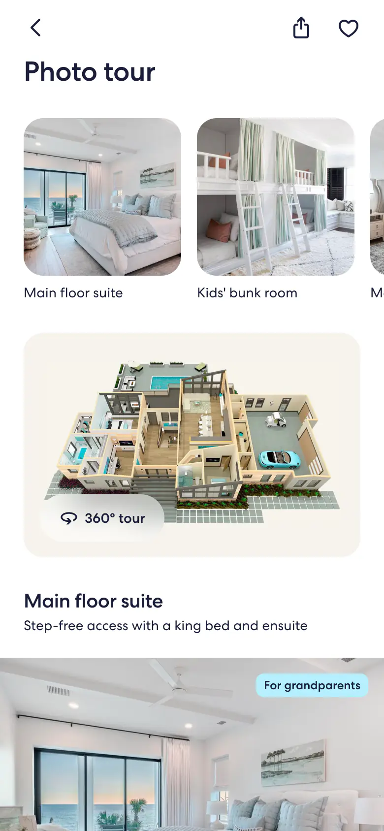
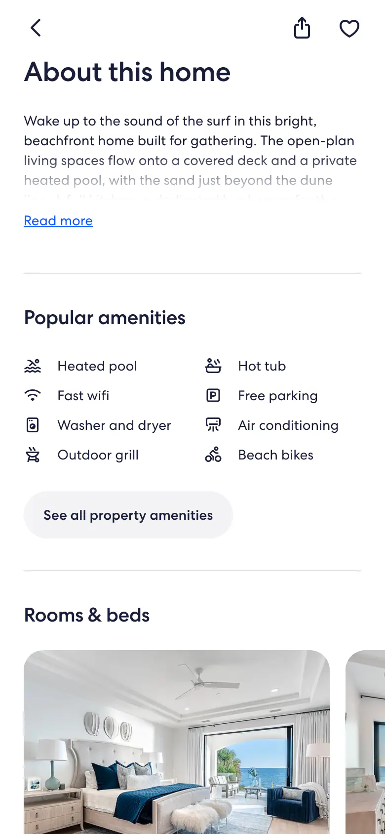
Fourteen flows came out of one page, and building them was the research. Every workaround went into a log.
A central Product Detail Page hub connects to nine flows: About, Photo Tour, Reviews, Rules, Cancellation, Booking, Summary, Share and Save. Four more open inside another screen rather than off the hub — Map and then Contact Host below About, Lightbox below Photo Tour, and Reviews-Sticky below Reviews.
A source-of-truth file feeds a high-level task list written in Claude, which fans out to a qualitative testing checklist and to Tyler's PR reviews; both feed prompt, refine, bugfix, then send and update the PR until it merges to main, which loops back to the task list. Off to the side, Cursor writes every inconsistency, struggle and design-system gap into feedback.md.
- EGDS first — anything else is a finding.
- No hardcoding; stand-ins are recorded.
- Don't hack around a recorded gap. The gap is the deliverable.
Four entries, on the screens that produced them.

- Inline row. The reference drew a rotated pile.
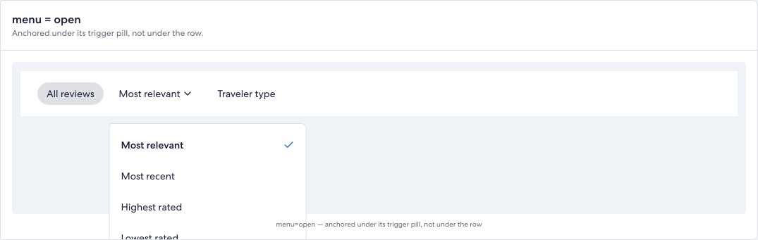
- Filter row cut off mid-word. Five layout attempts.
- Label leading, value trailing. Nothing in the kit.
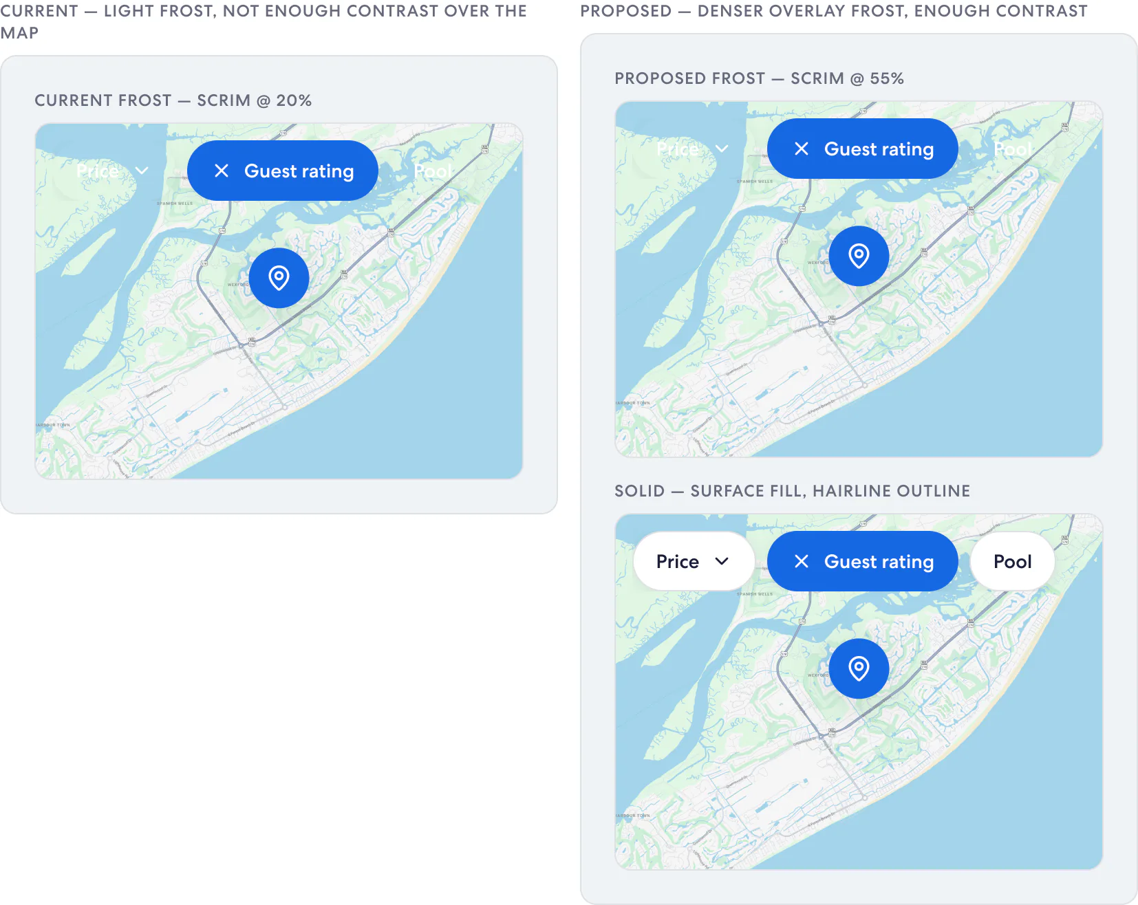
- Frosted pills at 20%, over whatever the basemap does.
Translation
From Finding to Proposal
Running notes conflate I couldn’t find this with this doesn’t exist. I was told much of what I’d flagged already existed, so every claim was graded against the spec.
How every claim was graded
- Grade A: It exists — the claim was wrong
- Grade B: It exists under another name
- Grade C: It partially exists
- Grade D: Genuinely absent, after searching aliases
| Finding | What the log claimed | What re-verification found |
|---|---|---|
| Grade A. Bottom sheet | No EGDS bottom-sheet variant at all | egdsBottomSheet was in the core spec throughout |
| Grade B. Tonal button | Missing | egdsButtonExperimentalTonal — a separate experimental set |
| Grade C. Select and removable pills | Missing | Both exist. Only the padding diverged |
| Brand foundations | VRBO overrides one corner-radius step | It overrides four of five — 8px is l in base EGDS, m in VRBO |
18
claims graded against the spec, the kit and the built tokens
1
graded A — it existed, and my claim was wrong
10
graded D — genuinely absent, after searching aliases
Two entries, at the two ends of the scale.
Grade D. OverlayFilterPillGenuinely absent, after searching aliases
- What changed
- Pills over the map carry a background instead of adapting to it.
- Why
- White labels measure 2.76:1 on the selected fill, and nothing in the kit brings its own surface.
- Proposed spec
- Select Pill, Button Overlay, 44px. Frost 20% to 55%, plus a solid fallback.
- Open question
- Frosted or solid as the default.
“there’s no EGDS component equivalent for this … and the design does not meet contrast ratio requirements”Faith, map screen
Grade A. BottomSheetIt exists — the claim was wrong
- What changed
- A bottom sheet was hand-rolled for gallery and house rules.
- Why
- The log recorded EGDS as having none, which is what justified building one.
- Proposed spec
- Withdrawn — it was in the core spec, so the entry became four changes instead.
- Open question
- Whether the keyboard defect was ever filed.
Told in phase 2 that a lot of these do exist in the kit already.
Four corrections did the most work. The first I argued against.
“This file was purely us looking at foundation applications… we didn't blow out detailed designs with real content”
What changed
I’d read a foundations exploration as a content spec, and defended it.
What it became
Reversed — 176 lines of DetailsPage.tsx.
“Update to stacked 1:1 images, propose as component need”
What changed
Overlapping was impossible; inline shipped, the pile became the proposal.
What it became
ImageStack — layout variant.
“Flag component need for an overlay filter pill”
What changed
2.76:1 on the selected fill; 1.06–1.54:1 on the basemap. Frost 20% to 55%, plus solid.
What it became
OverlayFilterPill — Select Pill, Button Overlay, 44px.

- Over land — basemap bands run 1.06–1.54:1.
- Same pill, water underneath.
“Check whether some could be composed from what's already in the library, as variants instead of new builds”
What changed
Items scoped as new were re-checked against existing anatomy.
What it became
Five of the eight became revisions, not additions.
Exploration
What It Took to Get There
Not everything took one attempt.
Attempt 1
Dated rows with radio-style dots
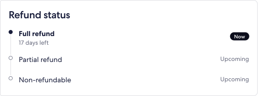
Nothing was selectable, and a refund state is an interval, not a date.
Attempt 2
A hand-built segmented rail
Read correctly, but composed a rail for a gap EGDS does not fill.
Attempt 3
Period rows on native DetailRows
Native throughout, and modelled no temporal state at all.
Attempt 4
StatusTimeline, followed literally
Ranges, cutoff times, a summary — every fact already stated further down the page.
Attempt 5
Cut back to the rail alone
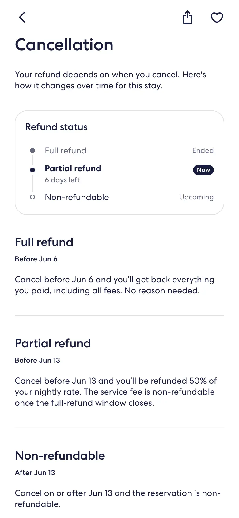
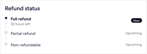
Answers one question: which refund window is in effect now.
Round one
- TodayFull refund
- Jun 6Partial refund
- Jun 13No refund
- Check-in
Round fiveCurrent = middle window
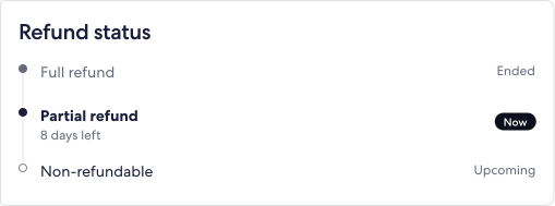
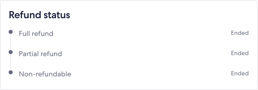
Refund status
- Full refundEnded
- Partial refund8 days leftNow
- Non-refundableUpcoming
Three pills in a 390px frame took three.
Attempt 1
Horizontal-scroll carousel
Chopped the third pill mid-word.
Described, not shown
Attempt 2
Let the row wrap
Fixed the cutoff and pushed the third pill onto a second line.
Described, not shown
Attempt 3
Nowrap, content-sized pills that refuse to shrink
Inline padding 4× down to 3×, gap 2×, trailing inset trimmed to 8px.
24leading inset354three pills and their gaps8trailing inset386inside a 390px frame
overflow variant.Contribution
Three New Components
Eight enhancements came out of the audit. Three the kit could not build from what it had.
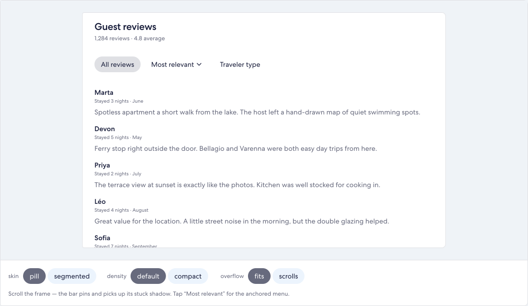
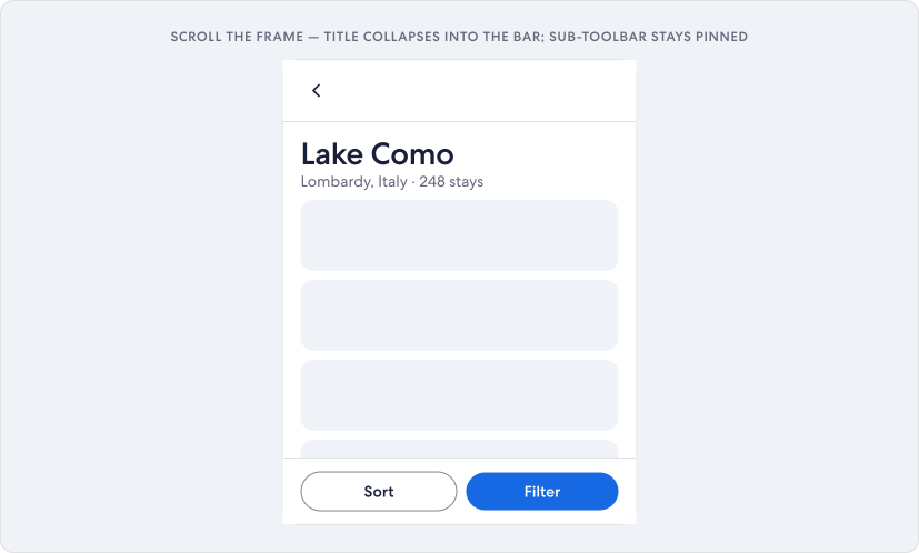
StickyFilterBar
New setIn place
Composed ofEGDS Tabs + PopoverSheet + ActionList. No single ancestor — the binding is the proposal.
Pins under the header, collapsing the pills that no longer fit into a menu.
OpenWhether the stuck container gets a neutral token of its own.
Toolbar
ImprovementComposed ofEGDS Toolbar — an additive sub-toolbar slot, not a new component.
A sub-toolbar slot holding the property title once the header scrolls away.
The collapse is driven by a target ref (an IntersectionObserver), not by a scroll offset.
OpenHeight is a constant, not a bound token — Figma and code carry 56 separately.
StatusTimeline
New setFirst window
Composed ofPorted from EGDS 1, absent from EGDS 2. Disclosure is Card + Divider + Icon — no expando primitive exists.
The refund schedule, after five rounds cut it back to the rail alone.
OpenNot localised, and whether the urgency styling is tokenised or only copy is unsettled.
Contribution
Five Variants
Five change components the library already had, where Amy’s review pushed them.
ImageStack
VariantComposed ofKit-local, not in EGDS. Promotion into the system is the prerequisite.
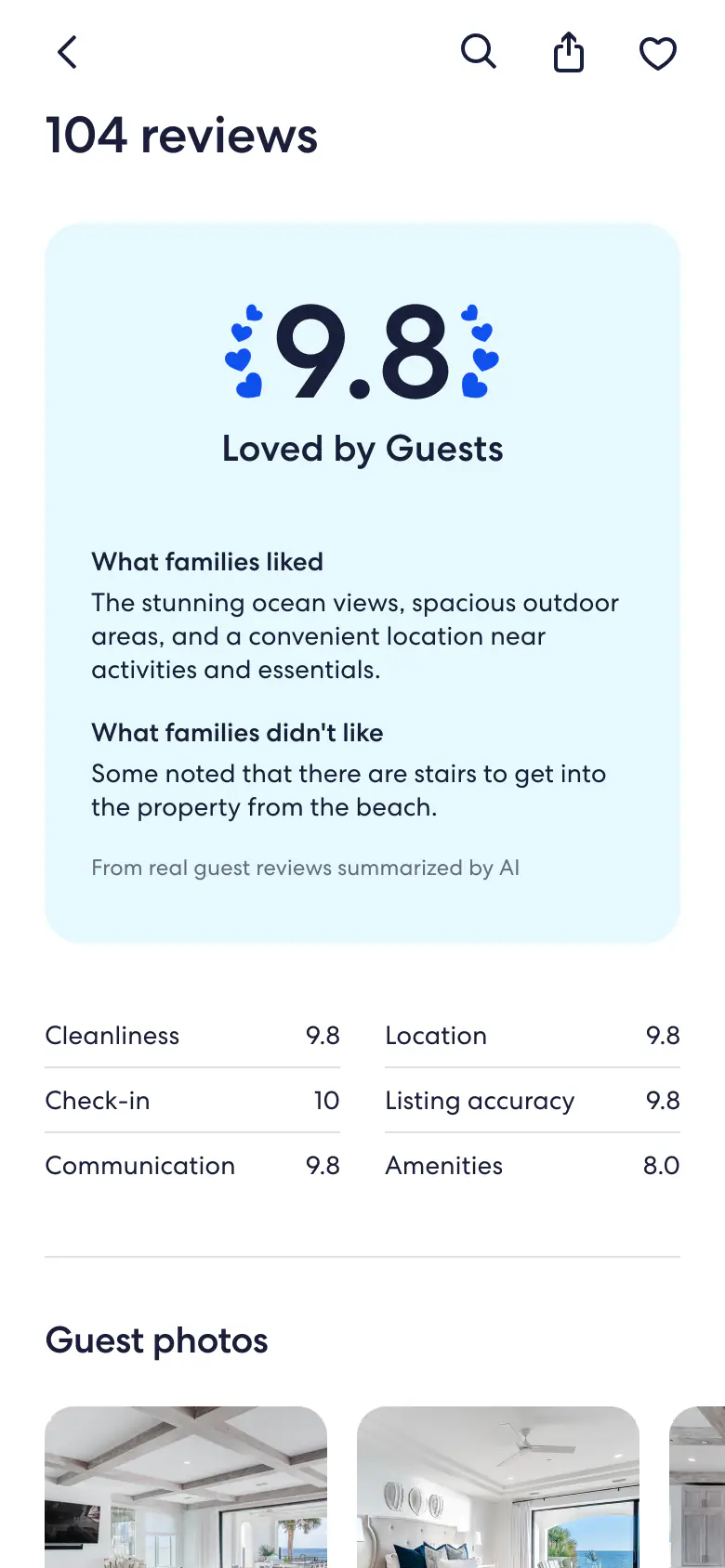
Review photos shipped as an inline row; the overlapping pile stayed a proposal.
OpenProposed and never drawn — no tile in the file carries a rotation.
BottomSheet
VariantComposed ofEGDS Bottom Sheet — the existing header prop, with handle added as a new enum value.
Four changes to the modal side sheet, one a keyboard defect every consumer inherits.
The other three: contentHeight sizes the sheet to its own content up to a maxHeight instead of the viewport; the scrim gains a frosted appearance with a solid fallback where blur is unavailable; and the focus behaviour below is corrected.
| Current | Corrected |
|---|---|
| Focus stays on the control that opened it, behind the scrim | Initial focus moves into the sheet container |
| Tab escapes into the page behind the scrim | Tab is trapped, wrapping first to last |
| Escape does nothing | Escape closes it, through the same animated dismiss |
| A plain container, to assistive technology | role="dialog" with aria-modal="true" |
Open decisionHandle fill token
White on the handle's marketing-token fill measures under 3:1.
- Keep it — decorative and aria-hidden, so the threshold does not apply, and it matches every grabber in the system.
- Move to on-surface-variant, which clears 3:1.
Open. A grabber's fill is a system call, and changing it here alone would break step with the kit.
DecidedSide Sheet parity
Side Sheet shares this anatomy, so a new prop is normally offered to both.
- Forward the handle, for parity.
- Leave it off, and recommend an edge swipe instead.
Not forwarded. A horizontal grabber on a side-anchored sheet advertises a vertical drag that does nothing.
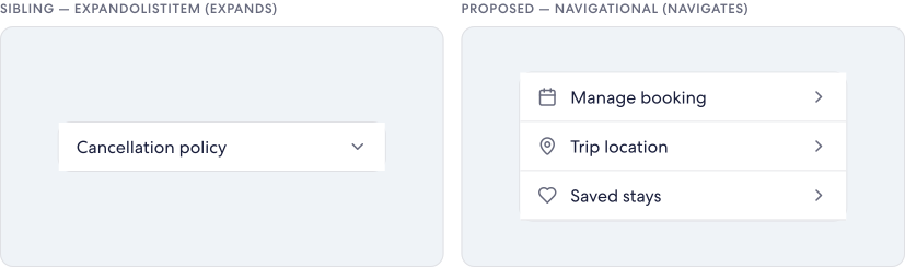
ListItem
VariantComposed ofEGDS ExpandoListItem anatomy, with navigational semantics instead of disclosure.
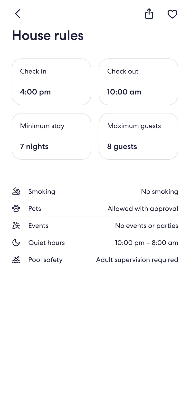
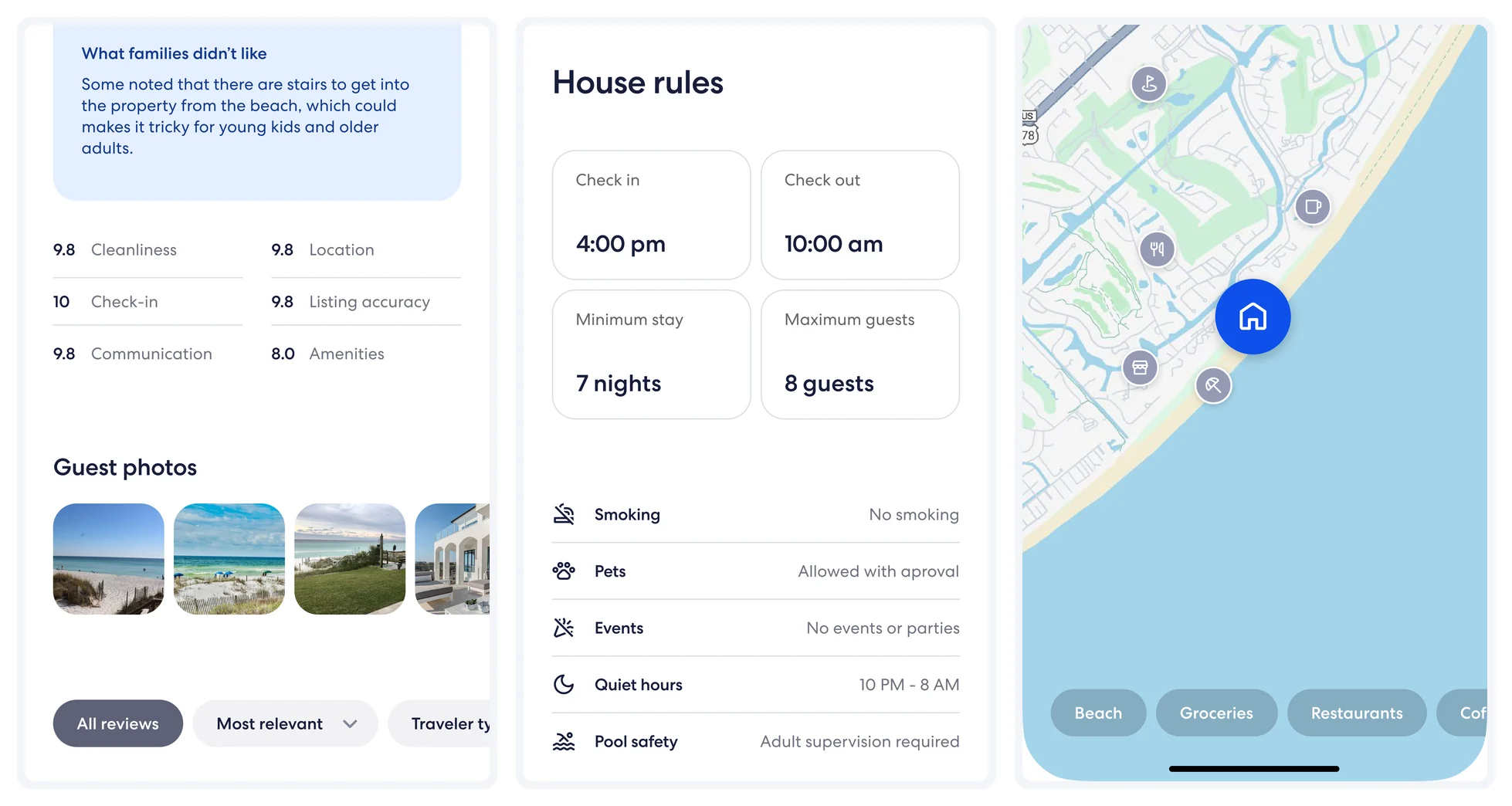
House-rules rows, as a navigational item and as a disclosure that expands in place.
OpenWhether the navigational variant should accept a button at all.
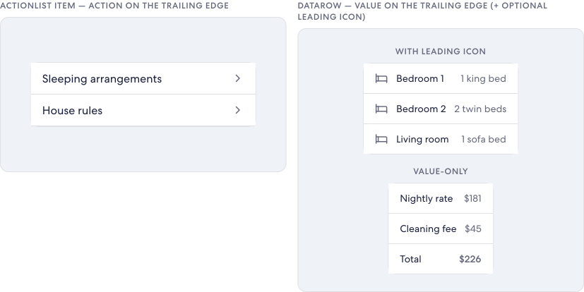
DataRow
VariantComposed ofEGDS ActionList / ActionListItem anatomy — leading label, trailing value.
Label leading, value trailing — a variant of ActionList, not a new primitive.
The label truncates on overflow; the value stays on the trailing edge on a single line. A divider separates rows within the list but not after the last row.
OpenWhether the value slot takes rich content or only a string.
OverlayFilterPill
Variant
Composed ofEGDS Select Pill, extended with the Button Overlay appearance at 44px.
Pills that carry their own background instead of adapting to the basemap.
One system, two appearances: both use the same chip anatomy and DS tokens. The frosted-strong version raises the scrim tint (--egds-frost-overlay-strong-tint) for legible white text; solid fills with surface plus an outline-variant hairline. Selected chips fill with primary.
Over #a8d8e8, 1.54:1 — fails the 4.5 minimum.
Over #c8d8e8, 1.45:1 — fails the 4.5 minimum.
Over #d8f8e8, 1.13:1 — fails the 4.5 minimum.
Over #f8f8f8, 1.06:1 — fails the 4.5 minimum.
1.06:1 to 1.54:1, depending only on where it lands.
2.76:1 improved to 4.62:1
White on the selected pill fill, before the change and after
11.20:1
The label over the frosted tint, on the proposed appearance
Open decisionFrosted or solid by default
Frost needs backdrop-filter, so solid ships either way — the question is which one is the default.
- Frosted, extending the existing overlay-blur system rather than adding a second one.
- Solid, with frost as the opt-in where the platform supports it.
Open, both specified. It reaches Badge, Button and IconButton too, so a pill proposal is the wrong place to settle it.
Final Product
High Fidelity
The page the eight came out of, running.
Validation
Parity and What Didn’t Ship
Shipping into a design system means three places must agree: UI Kit, spec, prototype kit.
The through-line
Composed, not net-new primitives
Each one binds existing EGDS parts — Tabs, PopoverSheet, ActionList, Card, Divider, Icon — into a behaviour the kit was missing, rather than adding fresh atoms.
Token-driven end to end
Colour, spacing, radius, and type all resolve to the design-system variables, so every surface re-themes from one source with no hardcoded values.
State is the real surface area
Value lives in the states — pinned vs at rest, expanded vs collapsed, near vs far — so each is proven across its full range, not just a happy path.
Outcome
What Shipped
What left the internship is uneven: prototypes finished, proposals specified, the last mile somebody else’s call.
14
VRBO PDP flows prototyped
3
new components
5
variants of components the library had
The deck calls all three net-new primitives. Toolbar is a slot on a component that already exists, so the handoff file counts it an improvement: two new sets, one improvement, five variants.
How much of the prototype is actually the design system
Three colleagues carried a piece further.
Additional contributions

Faith
Map content loading
Pan, skeleton, results update — the kit couldn’t show it.

Matt
The /plan skill
Asks scope and starting point, then sequences the work.

Andrew Wade
The EGDS Show
Where the workflow actually reached other designers.
- Waiting on others
- Whether any proposal reached the EGDS backlog, whether the keyboard defect was ever filed, whether the prototype pull request was ever reviewed.
- Found in my own file
- The rotated ImageStack was proposed and never drawn — no tile in the file carries a rotation.
Looking Forward
What I Took Away
I joined as Expedia Group’s first design builder intern — a new role built around AI-assisted design and prototyping — and spent it on the design system team. EGDS 2 is deep infrastructure: it reaches nearly every product in the company, which makes it an unusual place to hand an intern real scope. What made it work was that the project was horizontal. I wasn’t designing one feature; I was testing the system through a product and reporting back.
Not everything I flagged was a system problem. Some of it was VRBO-specific and some of it was me not knowing the kit well enough, and sorting out which was which is not something I could have done on my own.
Design-system work doesn't fit the usual case-study shape
The problem came out of building, and what I handed off isn't a screen.
You can't find gaps by reviewing a library
They only appear when you try to build with it.
The system belongs to whoever reuses it
Other people's input isn't a review step at the end — it's how the thing gets decided.