Expedia Group
Finding design-system gaps by building Vrbo’s property pages
Building VRBO property-detail flows and developing six new design system components from the gaps
- Design systems
- Prototyping
- Component design
- Role
- Design Builder Intern
- Timeline
- 10 Weeks
- Team
- Design-systems partner
- Senior designer
- Engineering code review
- Designer reviewers
- Tools
- Figma
- Cursor
- Claude
Overview
A working prototype, used as a test of the system
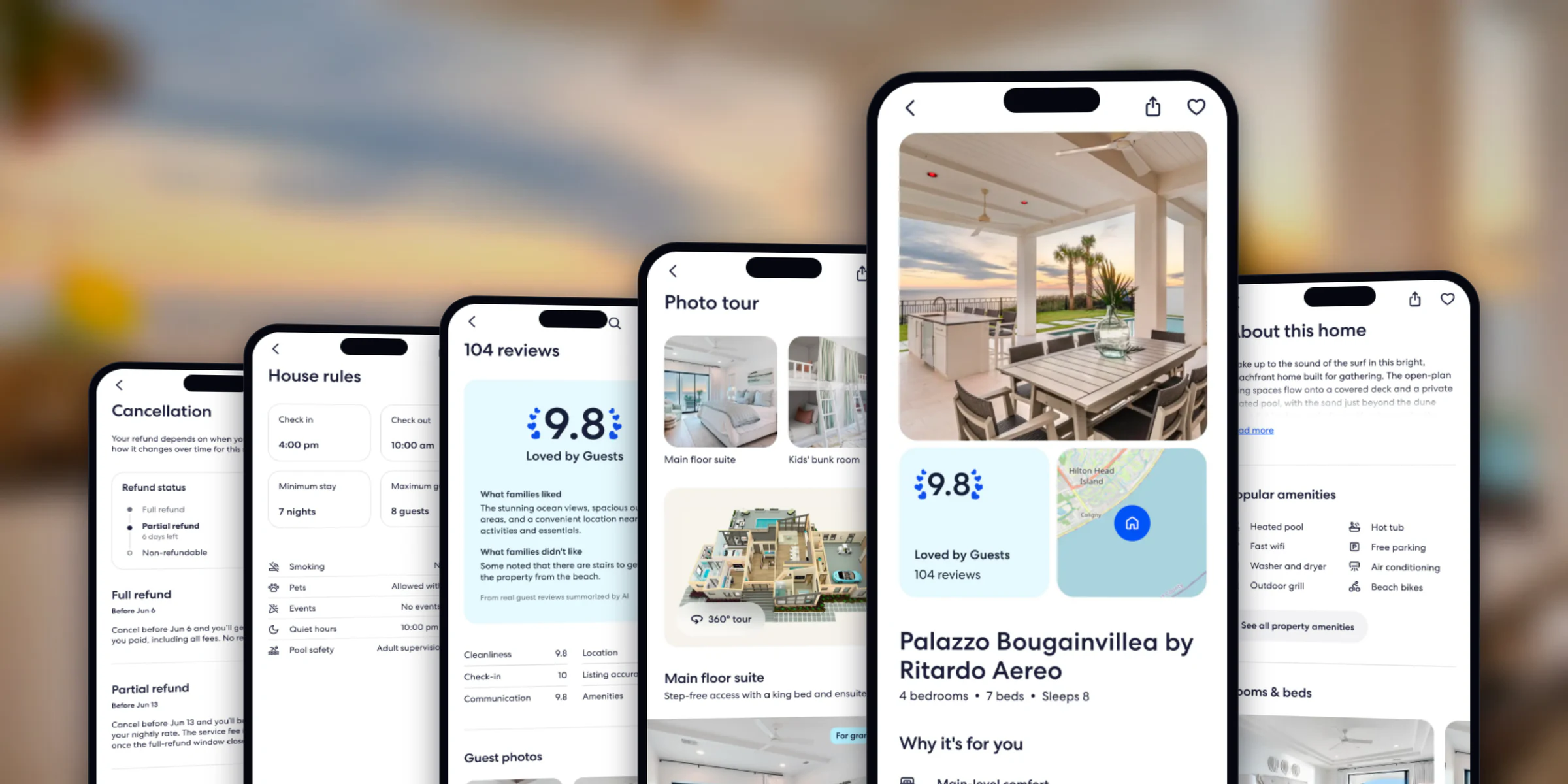
Over a ten-week internship I rebuilt Vrbo’s property-detail page — photos, reviews, map, policies, booking — with the Expedia Group Design System (EGDS). Where the system couldn’t build what the page needed, I logged the gap, and the strongest gaps became component proposals for EGDS 2.
- 14Property-detail flows built in the prototype
- 6Component proposals prepared for EGDS 2
Status: a working prototype and six proposals — three refined, three designed. The Photo Tour flow was merged into the team’s shared Vrbo prototype after code review. None of this is a production release.
What I did
- Built the 14 flows in the EGDS prototype kit, using Cursor and Claude.
- Logged each gap with the screen that exposed it.
- Drafted the proposals, their states and the open questions.
Done with others
- Amy, my design-systems partner, reviewed the gap list with me in two rounds.
- A senior designer on the team worked with me to put the proposals into Figma, the written spec and the prototype kit.
- Tyler reviewed my pull requests in the prototype’s code.
- Faith and Andrew, designers who work with EGDS, reviewed the prototype.
Why Vrbo
The densest page the system had to serve
A Vrbo listing asks one scroll to carry a photo tour, a hundred reviews with filters, a map, house rules and a cancellation policy that changes by the day. If the system has a missing behaviour, this page finds it.
EGDS is one specification that reaches designers and engineers in four forms. My project worked in three of them:
Written specificationProposals written
The source of truth. Each proposal adds a variant matrix, its props and the decisions still open.Figma UI kitProposals drawn
What designers place on the canvas. Proposals sit beside the components they extend.Prototype kitBuilt here
The code designers prototype with. All 14 flows were built in it.Production librariesOut of scope
What ships to travellers. No change to them is documented.
The diagram I started from showed every arrow pointing away from the spec, toward the people building screens. Nothing carried what a builder found back up to it. My brief was that return trip, for one product surface.
Prototype
Build first, then log what breaks
Try the prototype before reading on — both decisions below are on screens you can reach from its property page.

Prototype · not a production page
Try this
- Tap View all photos to open Photo tour, open a room, then use the back arrow to return to the property page.
- Open See all 104 reviews and scroll — the filter row is Decision 1.
- Open Cancellation policy — the refund status card is Decision 2.
Open live prototype (opens in a new tab)
Hosted on GitHub Pages and built for phone width.
Each flow ran the same loop: reconcile the reference designs, plan the build, build it with existing kit parts only, review, refine, merge. Anything the kit couldn’t do went into a shared feedback log with the screen that exposed it. The work ran in four phases: prototype, surface gaps, define the reusable patterns, then contribute them with a senior designer.
Review happened in code as well as in Figma. Tyler’s review of my pull request caught a full-screen sheet being removed the moment it was closed, before its exit animation finished. The fix keeps the sheet mounted until the exit completes, so it can close cleanly and open again. That flow, Photo Tour, was then merged as PR #47.
Close requested
Start the exit animation.
Exit completes
Allow the callback to run.
Unmount safely
The sheet can reopen.
The log turned into evidence. Four of the gaps, on the screens that exposed them:
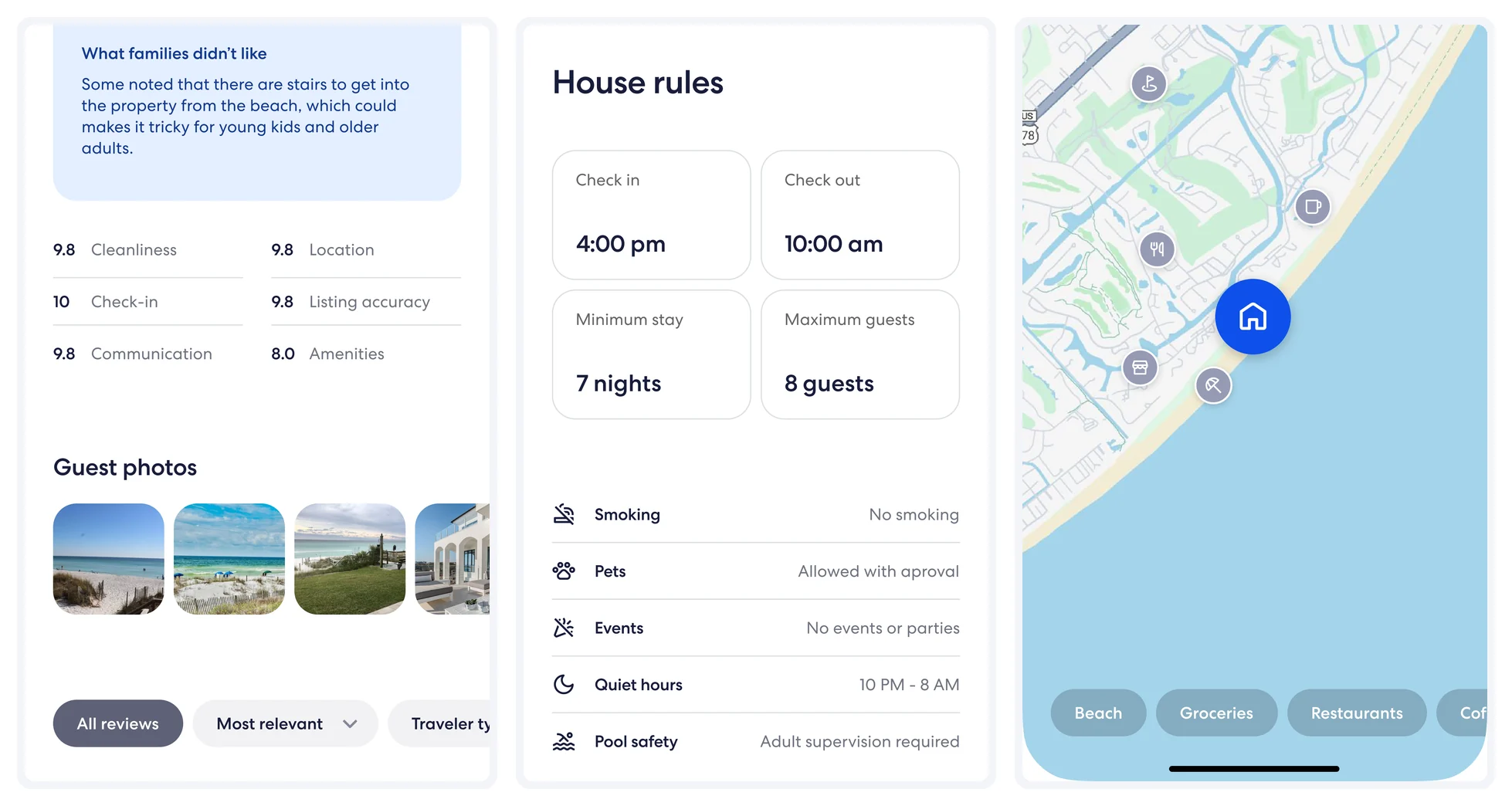
- Review photos — shown inline after Faith’s review; the overlapping layout became a proposal.
- Filter row — third pill cut mid-word. Decision 1.
- House rules — the kit had no label–value row. DataRow.
- Map filters — label lost at 20% frost. OverlayFilterPill.
Not every gap needed a new component. In review with senior designers, each one was sorted by the response it needed:
CarouselReconcile
Already being built elsewhere in the system, so dropped from my list.BottomSheetExtend
The existing sheet, with four changes.StickyFilterBarCoordinate
Existing parts that had to work as one pattern. Decision 1.Status timelineAdapt
An older EGDS 1 stepper, brought forward. Decision 2.
What review changed
Amy went through the list with me item by item: was each one an existing capability, work already in progress, a variant, or a genuinely missing pattern? Some items were cut, some became variants instead of new builds, and some turned out to be Vrbo-specific rather than system problems.
Filter bar
Three behaviours, one owner
Decision 1 · StickyFilterBar
Make pinning, overflow and the filter menu one component
StatusRefined — specified and reviewed, ready for the system team to continue
Original
The reviews page puts a row of filters above 104 reviews. On the screen recorded in the feedback log, the row runs out of width and cuts the third filter mid-word.

- “Traveler type” clipped at the screen edge.
Constraint
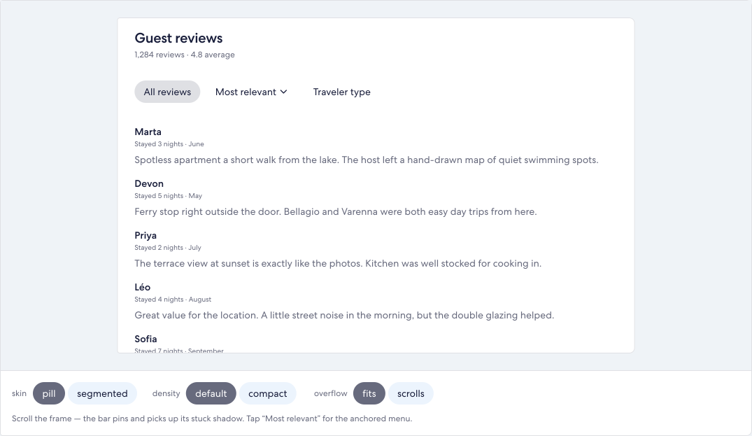
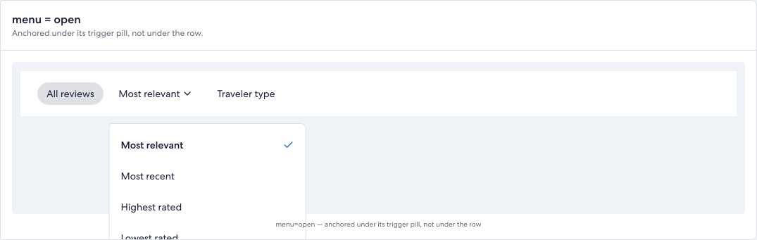
The reference pins this row under the header while reviews scroll beneath it, scrolls the row sideways when filters don’t fit, and opens a menu from a pill. EGDS had each piece — Tabs, PopoverSheet, ActionList — but nothing that did all three together. Wired by hand, they compete: the sticky container’s stacking and overflow can clip the anchored menu, and the row has to work out its pinned position from the header’s height.
For a traveller, that means the filters scroll away, or a menu opens cut off, exactly when they’re trying to narrow down a hundred reviews.
Iteration
A sideways-scrolling row cut the third pill mid-word. Letting the row wrap fixed the cut but pushed the third pill onto a second line. Pills sized to their content, and never shrunk, fit three filters in 386 of 390 pixels. That became one of two overflow states — fits, and scrolls for longer rows like the six filters on the reviews screen — instead of one layout that had to work everywhere. The first two attempts weren’t captured, so they aren’t shown.
Feedback
In review, the filter bar was sorted as coordination: the system had the parts, and what was missing was one owner for how they behave together. That ruled out a new tab or menu primitive.
Selected behaviour
StickyFilterBar composes Tabs, PopoverSheet and ActionList. It pins beneath the Toolbar, scrolls when the row overflows, and anchors its menu to the pill that opened it, so stacking and overflow are decided in one place. Its variants cover rest or stuck, fits or scrolls, two densities and two skins.
Status and open questions
Refined, as a new component set beside Tabs in the Figma kit, with a written spec and a prototype-kit component. Three things were left open: a neutral container colour at mid emphasis, whether the Toolbar should expose a sticky slot so the row stops calculating its own offset, and keyboard behaviour, which was not verified.
Refund status
From picking a date to reading a status
Decision 2 · StepIndicator
Show where the traveller stands in the refund policy, not a choice they don’t have
StatusRefined — ported primitive and the refund card built on it
Original
The first build drew the cancellation schedule as dated rows with radio-style dots. A filled dot reads as “selected” when it’s meant to say “you are here”, so the card looked like a date picker, as if the traveller could choose their refund.
Constraint
Refund windows are set by the policy and the calendar, not by the traveller. The card has to be read-only, change as days pass, and say how long the current window lasts. Someone deciding whether to cancel needs to know which refund applies today and when it ends.
Feedback
The reuse review pointed to a part EGDS already had: the EGDS 1 stepper, which describes position in a sequence. I ported it forward as StepIndicator, and StatusTimeline is the refund card built on it.
Round one to round five
Round oneReads as date selection
- TodayFull refund
- Jun 6Partial refund
- Jun 13No refund
- Check-in
Round fiveReads as policy status
Refund status
- Full refundEnded
- Partial refund8 days leftNow
- Non-refundableUpcoming
In between, the prototype’s record lists a hand-built segmented rail, period rows on native DetailRows, and the StatusTimeline spec followed literally — which repeated date ranges and cutoffs already stated further down the page. Round five cut back to the rail, answering one question: which refund applies now.
Selected behaviour
Each window is labelled Ended, Now or Upcoming, and the current one says how long is left, in days and then in hours inside the last 48. Try the windows:
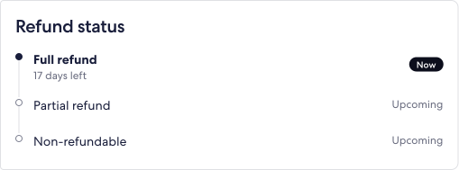
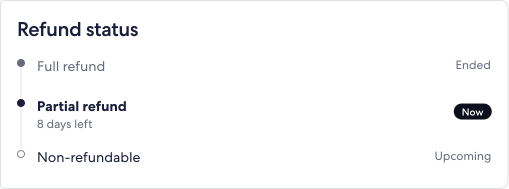
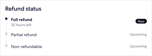
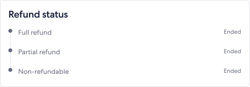
First window
Result in the prototype
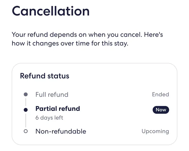
Refined. Open: date and time copy isn’t localised, and locale and time-zone behaviour still need defining.
Other proposals
The other four, and what each asks of the system
The rest of the six, each with the change it asks for and how far it got. Refined means iterated through review and ready to continue. Designed means drawn and specified, not yet validated.
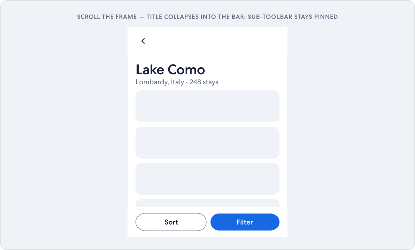 Full size (opens in a new tab)
Proposed state only — there is no export of the page before. Toolbar
- Response
- Extend
- Change
- New prop on the existing Toolbar
- Status
- Refined
Scrolling the hero away took the property name with it. The prop carries the title and back control into a compact header instead of adding a second header.
Open The Toolbar's height is a shared code constant with no Figma equivalent yet.
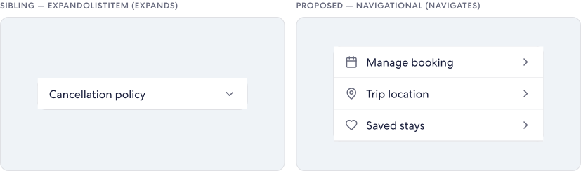 Full size (opens in a new tab)
Left: the library's expanding row. Right: the proposed navigating row. ListItem
- Response
- Extend
- Change
- New variant, beside the expanding row
- Status
- Designed
The library only had a row that expands in place. Rows like Manage booking go somewhere else, and the affordance should say which of the two a row does.
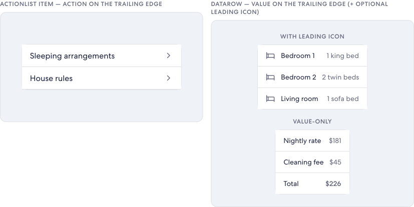 Full size (opens in a new tab)
Left: an ActionList row, with no place for a value. Right: the proposed DataRow. DataRow
- Response
- Reuse
- Change
- New variant on ActionList
- Status
- Designed
Rooms, beds, house rules and price lines are label–value pairs. Reusing ActionList's icon, label, trailing slot and divider avoided a new primitive.
 Full size (opens in a new tab)
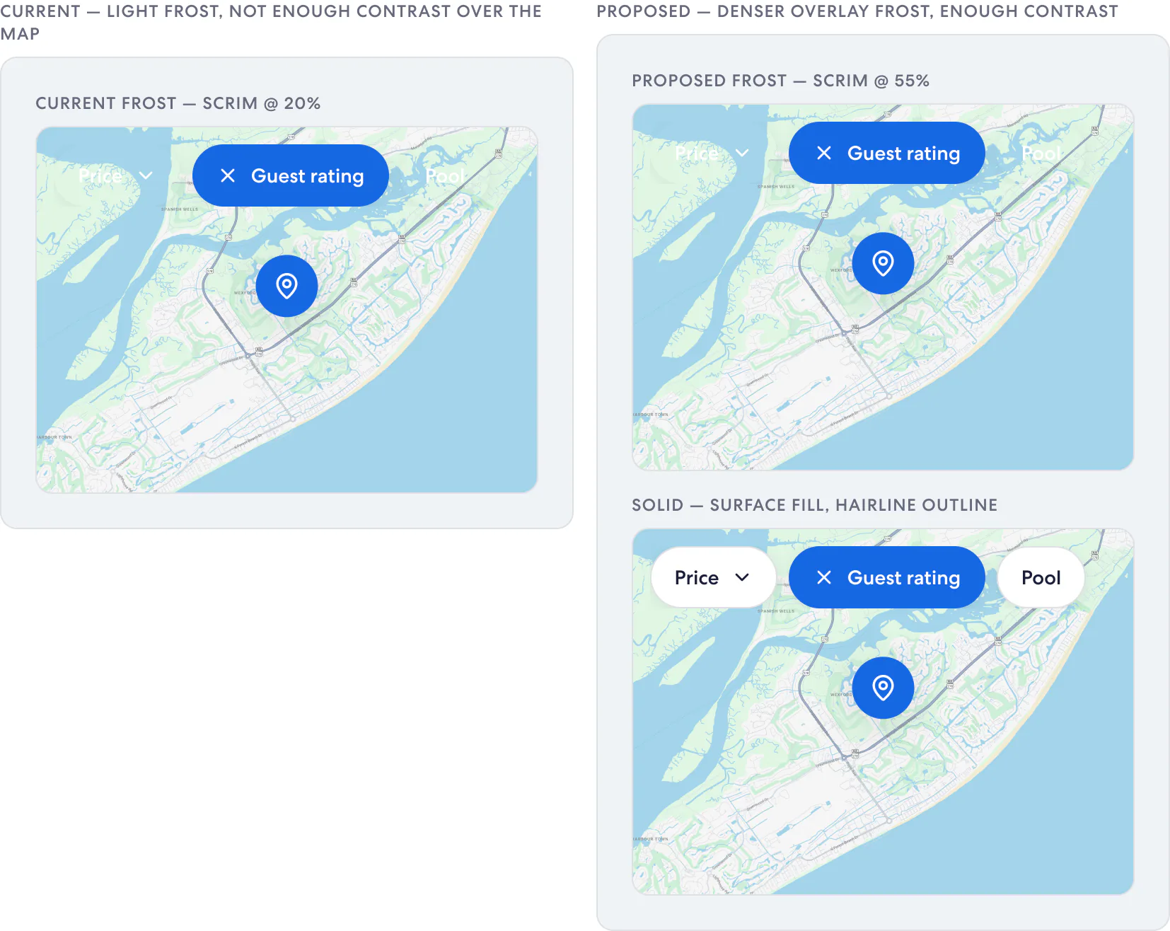
Left: the reference at 20% frost. Right: the proposed solid pill. OverlayFilterPill
- Response
- Extend
- Change
- Overlay variant of Select Pill, at 44px
- Status
- Designed
Faith flagged the map filters: at 20% frost the label sat on roads and water. A solid surface is predictable; a denser frost keeps more of the map.
Open Solid or 55% frost, selected-state contrast and fallback behaviour stayed open.
How the gap list became the six
The response list in the Prototype section and these six aren’t the same list. Carousel was dropped as work in progress elsewhere. BottomSheet’s four changes (handle, content height, focus, scrim) were designed and are tracked separately from the six. StickyFilterBar and the status timeline became the two decisions above. ImageStack’s overlapping photo layout was proposed but never drawn.
Delivery
What exists, and what hasn’t been measured
Delivered
- A 14-flow Vrbo property-detail prototype in the EGDS prototype kit.
- Photo Tour merged into the shared Vrbo prototype (PR #47) after code review.
- Six component proposals with states, written specs and renders.
- A log of the gaps found while building.
Status
- Three proposals refined, three designed.
- Prepared for EGDS 2. Acceptance into a production library isn’t documented.
- No change to a customer-facing Vrbo page is documented.
Not yet measured
- No usability testing with travellers.
- No production, conversion or adoption data.
- StickyFilterBar’s keyboard behaviour.
Reflection
Building was the research
The gaps that mattered were behaviours — pinned, overflowing, current, upcoming — and none of them show up in a component inventory. They only appeared when a real page had to do several things at once. Review then decided more than my first drafts did: Amy’s questions are why most of the six extend something EGDS already had.
Next, I’d test the two refined components with travellers and with keyboard and screen-reader users before asking anyone to adopt them. The refund card’s wording and the filter bar’s menu are the parts most likely to fail.
At the end of the summer I sat down with Rachel Been, Expedia Group’s SVP of Design, to talk about her path as a designer and as a leader.