Milieu
Crafting a mobile app for a startup redefining personalized skincare using DNA
Background
The Why
Have you ever considered that your skincare wasn’t made for your skin? Most of it wasn’t. It’s mass-produced for an average face, with ingredient lists most people can’t parse.
Milieu’s answer starts in the post.
A kit arrives
A microbial DNA swab, posted to the customer.
The sample goes back
Sequenced into a reading of what actually lives on that skin.
The questions
How the skin behaves — what it does after cleansing, what it shows, the one priority.
The routine
Products chosen against the biome reading and the answers together.
Neither half is enough alone. The sequencing says what is on the skin; the questions say what the person is trying to fix.
And then it repeats. The biome shifts, the next sample resets the reading, and the routine is rebuilt — so the routine is a subscription, not a result.
All of that lived on desktop, which is the problem the project existed to fix: a routine happens in a bathroom, minutes long, standing up, and none of that is where a laptop is. So the objective was narrow — a native mobile app giving people their own skin data, aligned with the existing web ecosystem. Parity, not a second product, and not a responsive shrink of the first one.
I joined as one of two UX designers on a five-month push toward launch.
Research
Understanding Users
The person I designed for was Linda: 28, a designer in Seattle, sensitive skin that flares easily, careful about which products she puts together. She found Milieu, sent in a DNA sample, and got a routine built for her skin. She also does her skincare in the morning, minutes before work — which is the part that mattered. She was never going to open a laptop to check whether her barrier score had moved.
So the research question wasn’t whether people wanted the data. It was what the data was costing them to reach: determine how to lower the average time to complete our proposed task flows by improving the mobile experience.
So I built four tasks, one landing in each main view. That coverage is the point: no part of the app could pass the test by being skipped.
Four tasks, four views
- Home — track six months of skin health
- Biome — find a resilience level
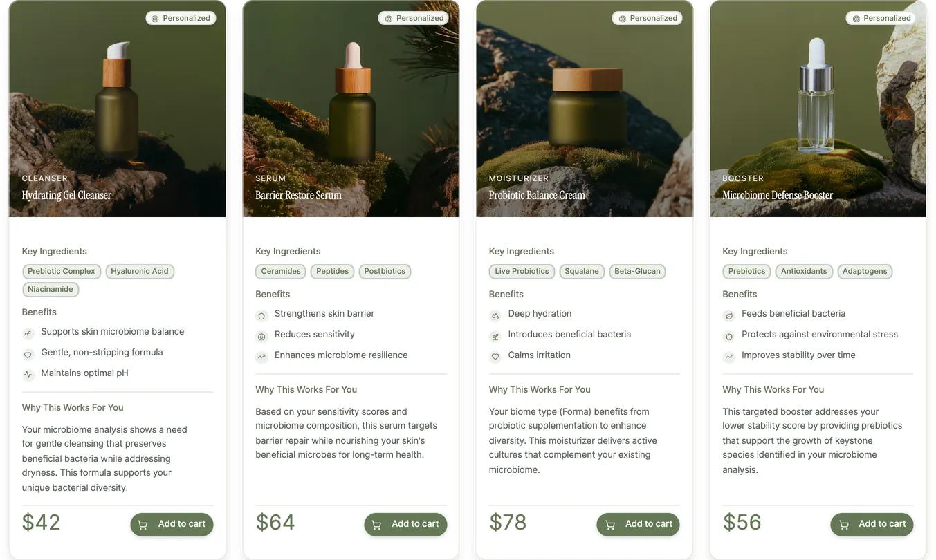
- Profile — repurchase a gel cleanser
- Flora AI — ask what order to use the products in
Round one ran against the desktop frame resized to a phone breakpoint. That is the baseline worth naming: not a mobile design, just the web at phone width — the exact thing we were being asked not to ship. One participant, four tasks, an average of 36 seconds each, and a lot of scrolling past the thing they were looking for. What they said afterwards was about comprehension rather than speed: “When following the steps, I was unsure what all the different microbiomes meant and how it would be applicable to my skin.”
Translation
Mobile Patterns
There are two ways to put a product on a phone and only one of them was worth five months. Mobile web is a responsive adaptation — desktop structure compressed and stacked until it fits. A mobile app starts from the device instead: touch, speed, and the fact that someone is using it standing up.
| Responsive page | Native app |
|---|---|
| A menu at the top of a long scroll | Bottom navigation, inside thumb reach |
| Hover states, on a device with no hover | Swipe and tap — gestures the device actually has |
| Every level of detail present at once | Progressive disclosure: dense biome detail available without being present |
| Related readings stacked down the page | Card carousels putting them side by side in one row |
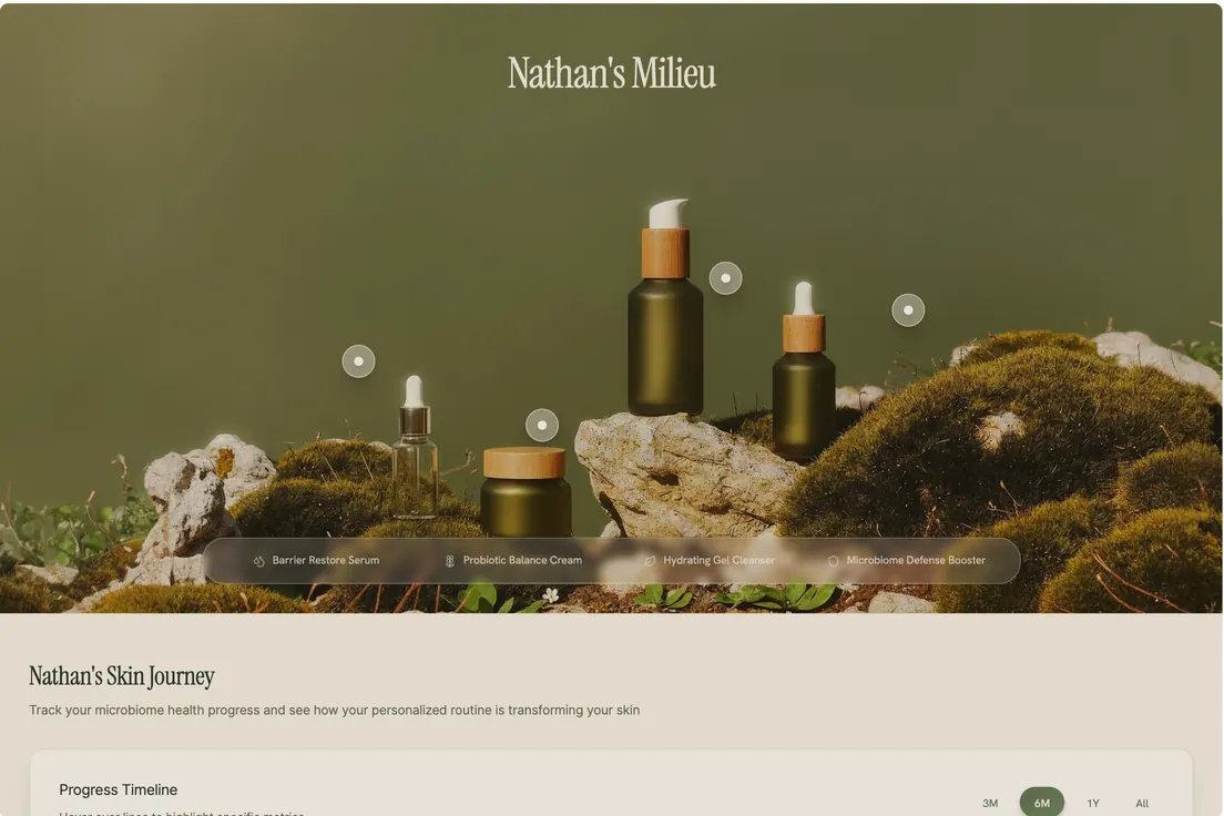
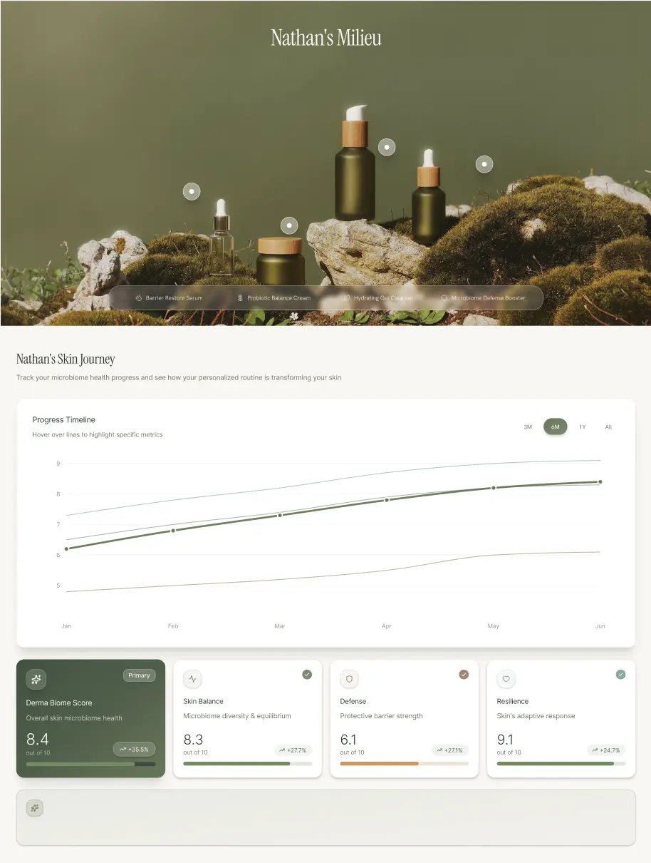
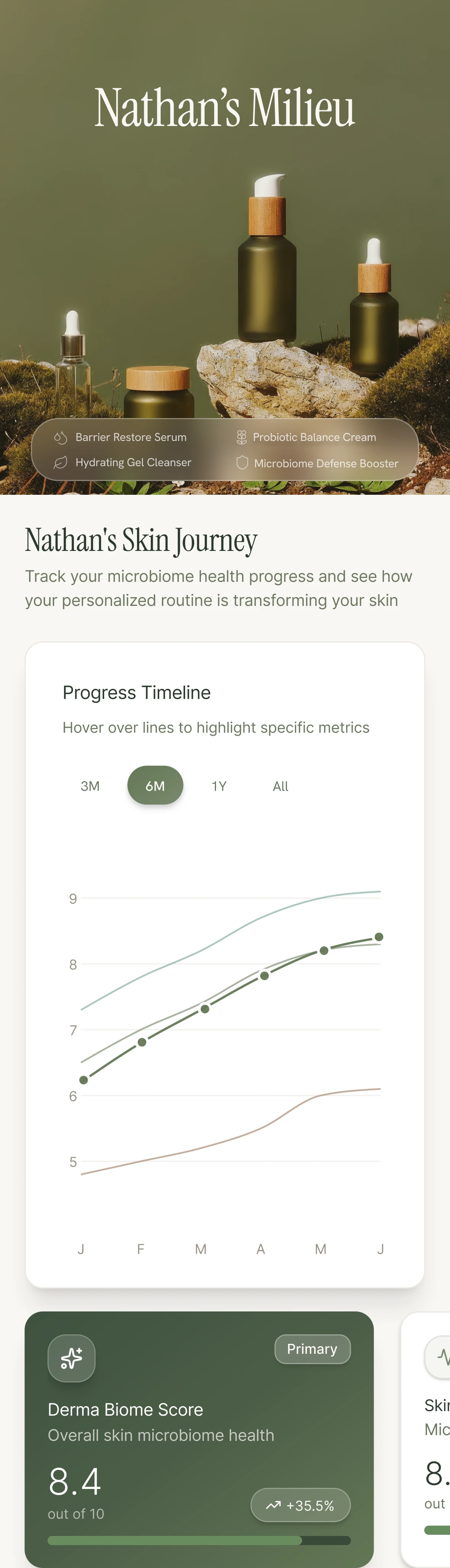
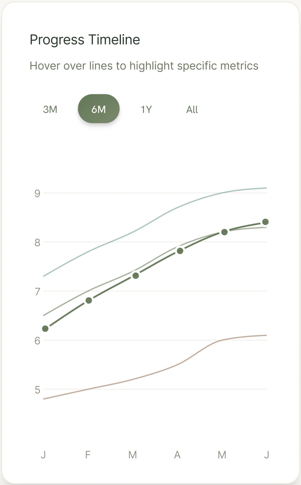
Mobile reading is different: one hand, faster scanning, less patience for dense charts. On desktop, Nathan’s Skin Journey spreads across a wide Progress Timeline with a row of four score cards beside it — Derma Biome 8.4, Skin Balance 8.3, Defense 6.1, Resilience 9.1. Resize that and the score and the timeline both fall past the fold, which is what round one demonstrated. So I mapped the web’s information density onto mobile-native patterns, letting the same content surface progressively without inventing a second product.


What only the pair shows is hierarchy: product photography and the journey title stay, while the Progress Timeline and the primary score come up to meet the fold. The carousel and the range chips are what let them.
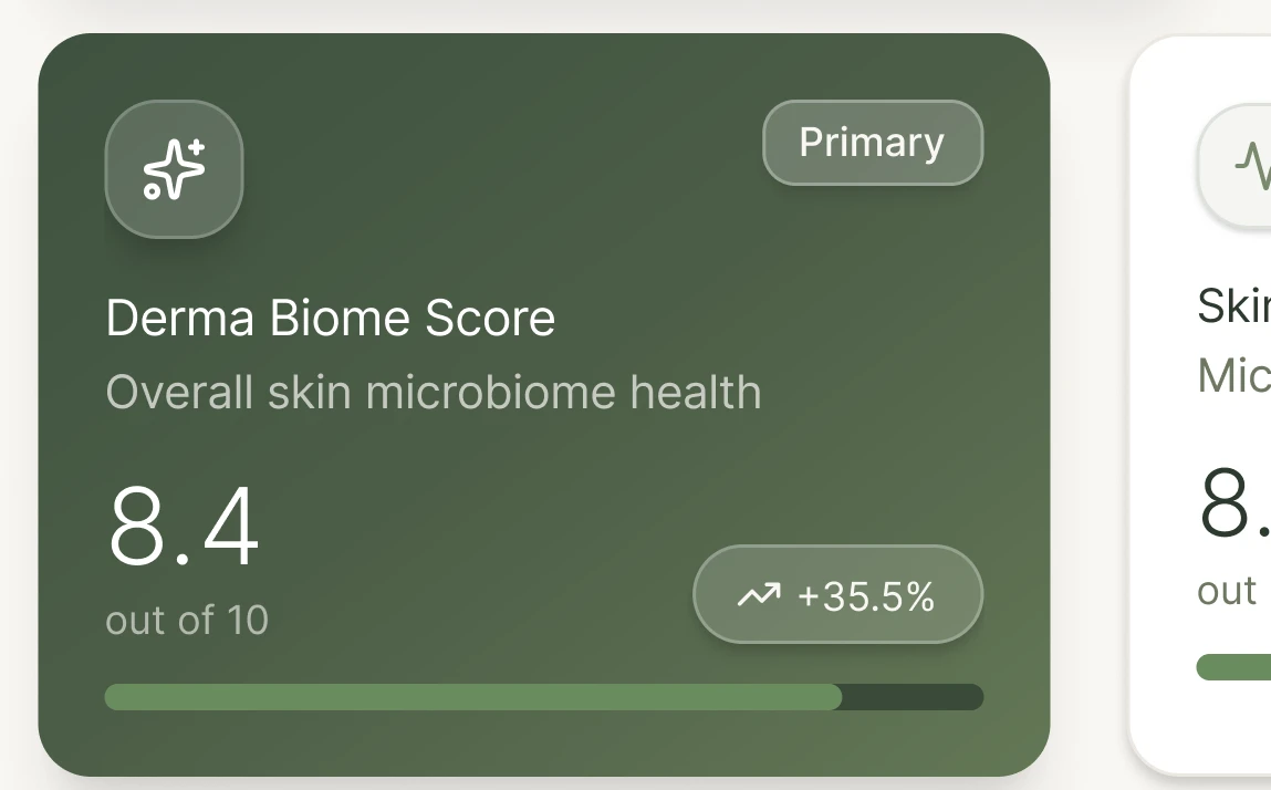
Decision — Score carousel. Related readings stay in one row rather than stacking down the page.
Primary
Derma Biome Score
Overall skin microbiome health
8.4out of 10
+35.5%
Skin Balance
Microbiome diversity & equilibrium
8.3out of 10
+27.7%
Defense
Protective barrier strength
6.1out of 10
+27.1%
Resilience
Skin’s adaptive response
9.1out of 10
+24.7%
Derma Biome Score — 1 of 4
Decision — Range chips. Time ranges become selection states, and all four trend lines stay in one card rather than behind a hover reveal.
Progress Timeline
Hover over lines to highlight specific metrics
6M — January to June.
Highlight a line
Look at the subtitle on that card: “Hover over lines to highlight specific metrics.” The interaction had been rebuilt for tap, and the instruction telling users to hover shipped anyway. Copy sat outside the component work, so it was not on the list of things a pattern change touched — which is how a five-month timeline hides a contradiction in plain sight on the screen that demonstrates the fix. It is what a copy audit catches and a component audit does not.
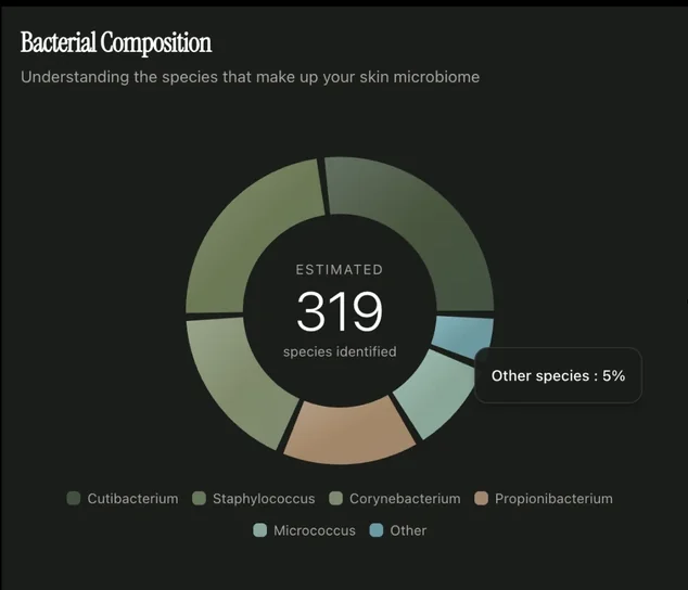
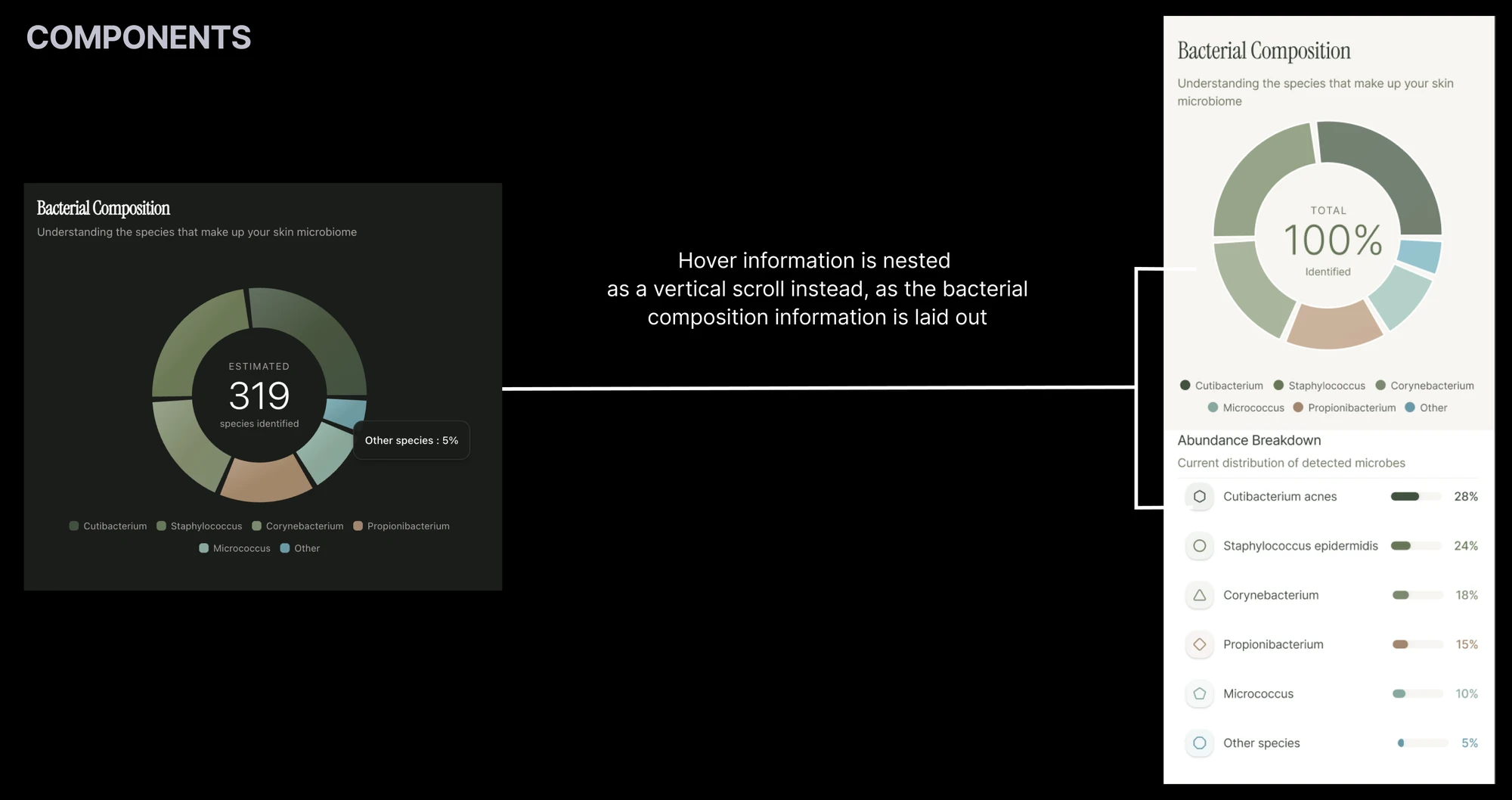
Decision — Hover becomes a scroll. On the web, the bacterial composition donut reveals each species on hover, one tooltip at a time. There is no hover on a phone, and a tap target the size of a donut segment is a guess. So the hidden layer became a visible one: the same six species laid out below the chart as an Abundance Breakdown, with shares and bars. Nothing sits behind a gesture that doesn’t exist.

Consistency wasn’t optional. Users move between web and mobile, and two designers were building different halves of the same app at once — shared IA and terminology kept those halves aligned, while interactions stayed native on each device.
Synthesis
What Success Looked Like
- Ship a mobile app that feels native — not a shrunken web page
- Keep skin scores, progress, and routines easy to find and act on
- Preserve information parity with the web so cross-platform use stays coherent
Four metrics carried those goals, agreed before I drew anything:
Success metrics
- Cognitive load — dense biome detail sits behind progressive disclosure rather than one wall of UI
- Purchases — the repurchase path is findable without hunting for it
- Mobile-web parity — labels and structure match the web, so nobody relearns the product
- Diagram interpretation — the charts can be read on a phone, not merely displayed on one
Naming Purchases as a design metric mattered more than it looks. It’s the one that stops “make the data legible” from quietly becoming the whole brief.
Ideation
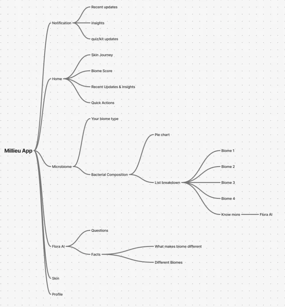
Information Architecture
- Milieu App
- Notification
- Recent updates
- Insights
- Quiz & kit updates
- Home
- Skin Journey
- Biome Score
- Recent Updates & Insights
- Quick Actions
- Microbiome
- Your biome type
- Bacterial Composition
- Pie chart
- List breakdown
- Biome 1
- Biome 2
- Biome 3
- Biome 4
- Know more ⇢ Flora AI
- Flora AI
- Questions
- Facts
- What makes a biome different
- Different biomes
- Skin
- Profile
- Notification
Home and Notifications carry the highest-frequency reads — scores, trends, and updates. Deeper biome science and Flora AI sit one level down, so the first screen stays a status check rather than a textbook.
One branch I left open. Mapping the web sidebar onto mobile navigation found a home for every item except pop-ups, which I annotated “also found at top of Home or will be nested in Profile later on.” I had no evidence about how often someone would want to revisit an alert, and neither placement was obviously right. Writing the uncertainty into the file was more useful than resolving it to look decisive.
Accessibility
Contrast and Cognitive Load
Partway through, the question changed. It stopped being how to get this onto a phone and became: how can I improve the accessibility of Milieu’s interface?
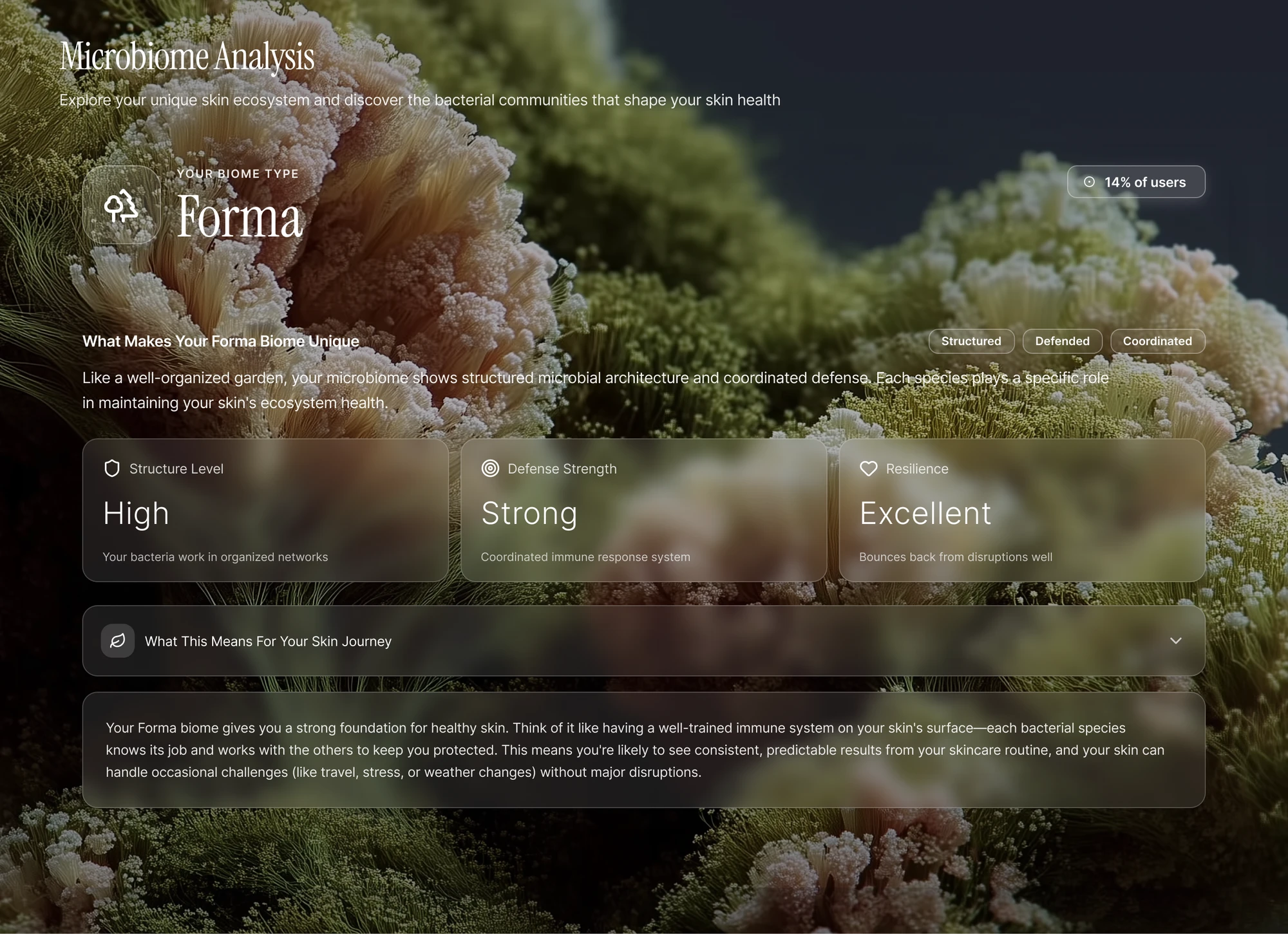
Contrast. The design system leaned on the current fashion — glassy translucent panels over photography — and photography is a hostile substrate for text.
Over #8a847b, 3.71:1 — fails the 4.5 minimum.
Over #757660, 4.65:1 — clears the 4.5 minimum.
Over #4c553a, 7.87:1 — clears the 4.5 minimum.
Over #1e212c, 16.04:1 — clears the 4.5 minimum.
3.71:1 to 16.04:1, depending only on where it lands.
Two of those pass, one passes by a fifteenth of a point, and one fails — and which you get depends on nothing but where the text lands. No choice of photo fixes that, because the problem is the variance rather than the picture. So the text moved onto a solid panel and the photograph stayed behind it, doing the job it is good at.

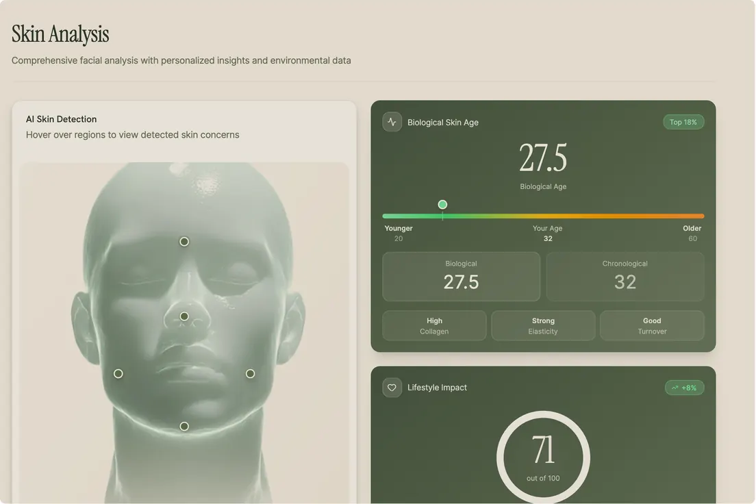
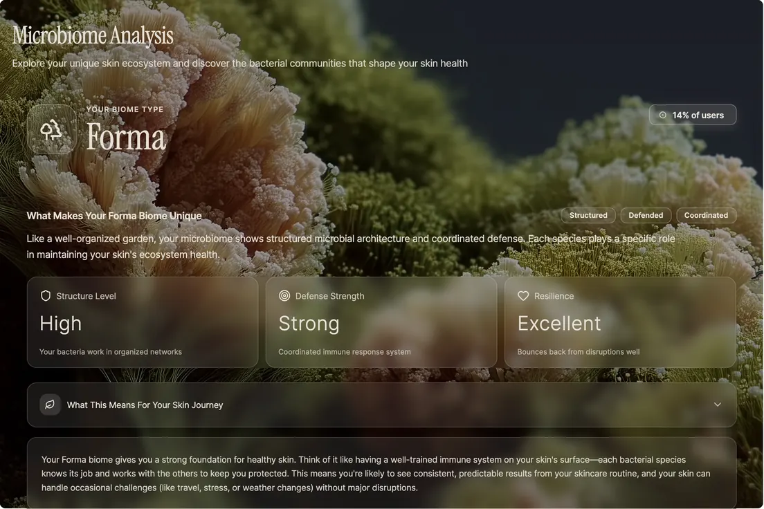
Cognitive load. Then I marked up the Microbiome Analysis screen and started taking things out.

- Repeated information — the chip row restates what the cards below it already say.
- High, Strong, Excellent. Three readings with nothing to tell a reader what to do about them.
- A dropdown that opens onto nothing.
That third one is the cognitive-load metric in miniature: a number nobody can act on isn’t information, it’s decoration. Skin biology that didn’t help someone decide anything came out, and the two places saying the same thing became one.
Final Product
High Fidelity
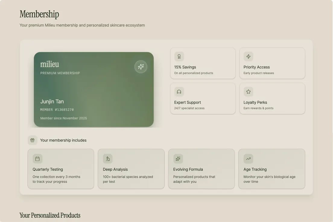
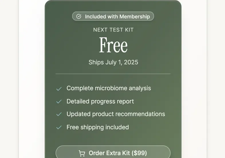
Two prototypes cover the core loops: Home (skin status and progress) and membership (subscription, testing, orders).
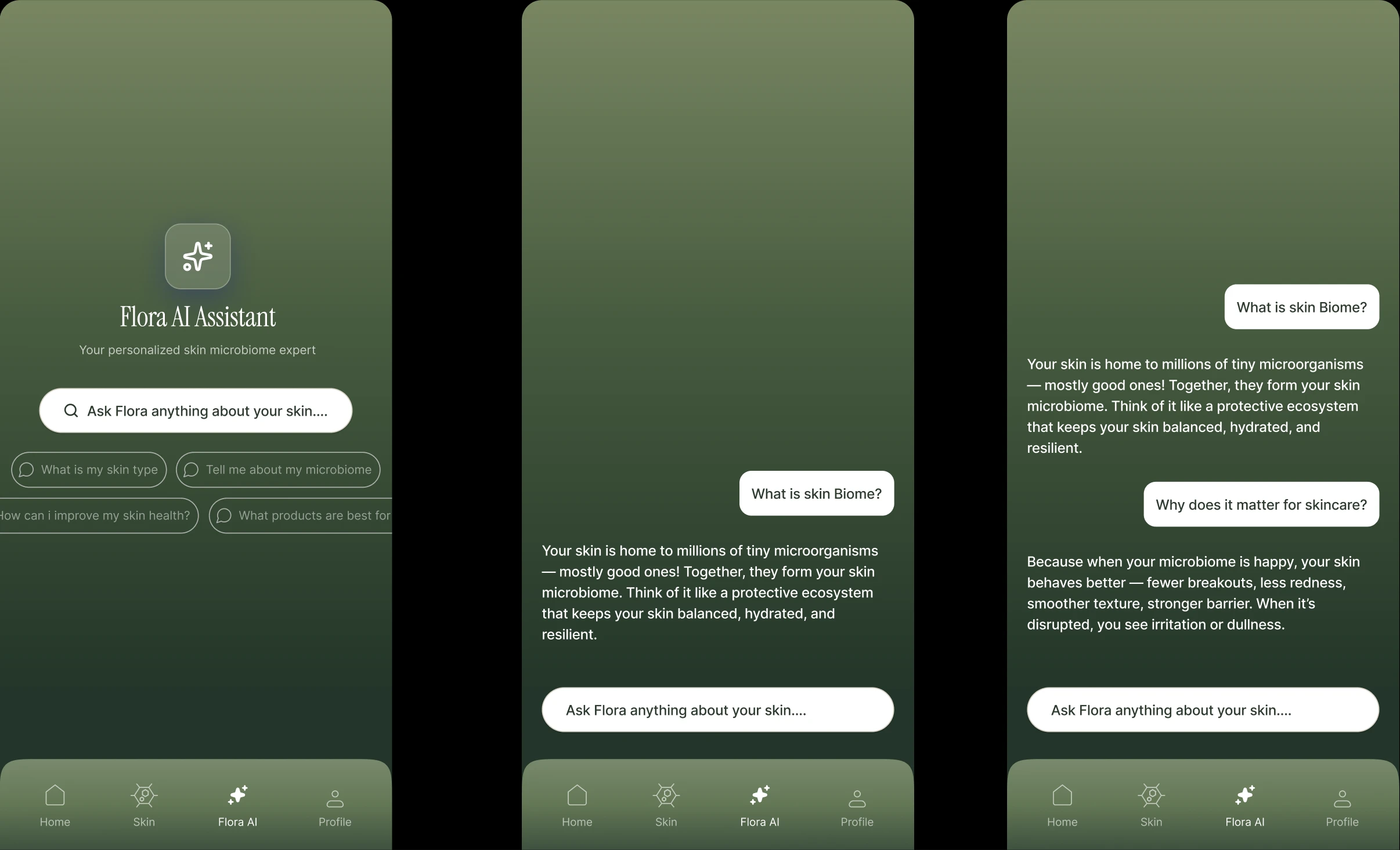
Decision — Flora AI. Complex biome concepts get a conversational layer so explanation doesn’t have to live only inside charts.

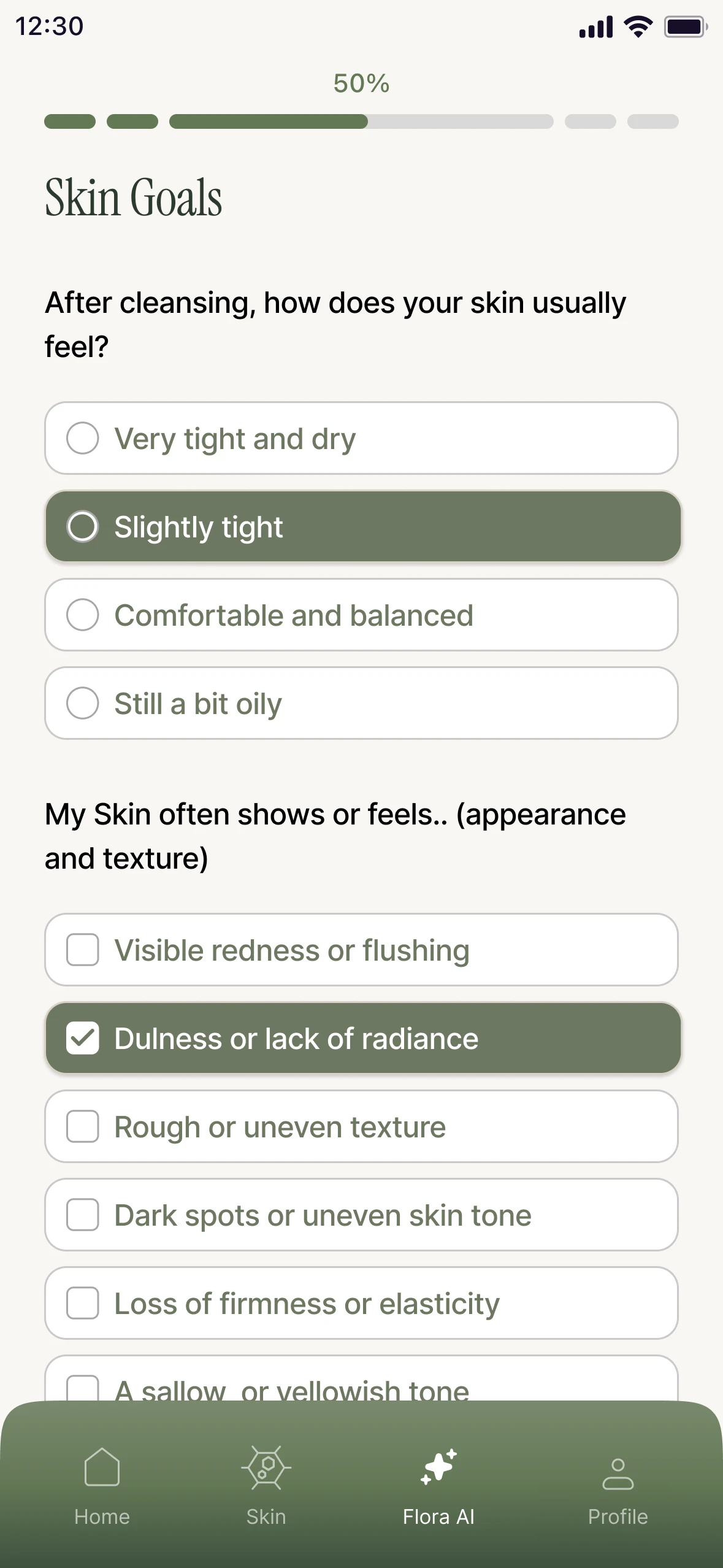
Decision — Onboarding. Break a long form into focused steps with progress indicators so users know where they are and what’s left.
Register the kit
The six-character code on the test kit. A checklist over the app, not a page of its own.
Skin Goals
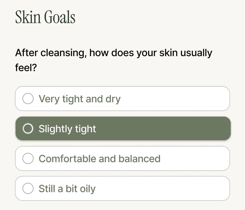
How it feels after cleansing — one of four. Then what it shows or feels — any of six. Two questions, two selection rules, one screen.
The one priority
A single #1 concern from seven. This is what the routine gets built against.
Then the routine — these answers read against the biome data from the kit.
No tab bar, and a close control top right: onboarding takes the app over for as long as it runs, and the way out is to leave it rather than to navigate away from it.
Skin Goals
Reading that frame properly corrected two things this page had been claiming from a slide. There is a Back button on the step, so the flow is not one-way. And there is no tab bar at all — just an ✕ — so onboarding is a takeover, not a section you wander into and out of. The slide implied both the other way round, and only the file settles it.
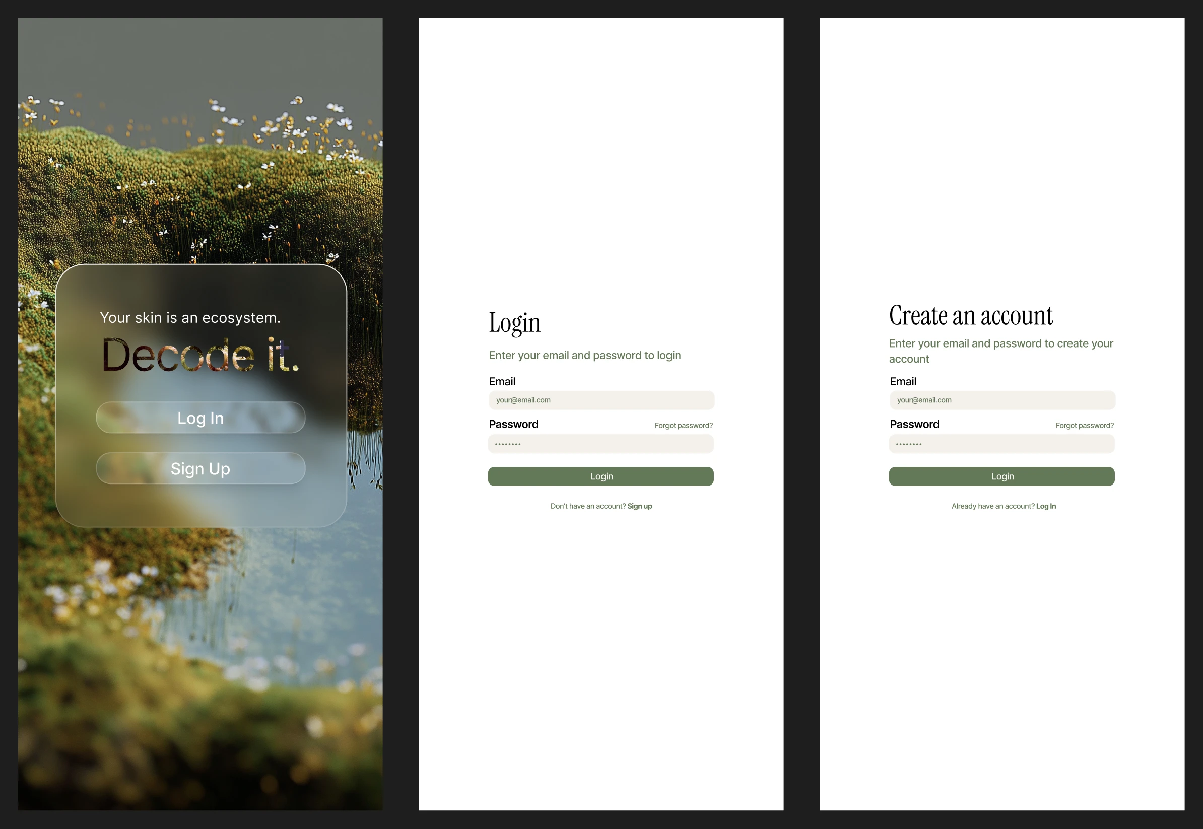
Decision — Auth. The mossy landing and short forms set brand tone before the first dashboard read, with minimal fields so entry stays out of the way.

Validation
The Same Four Tasks
Then I ran the same four tasks again, this time on the mobile UI.
The same four tasks, run twice
- Round 1 — 36 seconds average per task, on the desktop frame resized to a phone breakpoint
- Round 2 — 28 seconds average per task, on the mobile app
- One participant per round — and not the same person in both
- Averages only — per-task times were never recorded, so the eight-second gap is a direction and not a measurement
Which is why I won’t put more weight on it than that. The direction is real; the magnitude isn’t something I would defend. With one person per round, the honest ceiling on this result is that nothing got worse, and that the new components were used without needing explanation.
What I trust more than the timing is where someone went unprompted.
- Milieu App
- Profile
- Subscription — reached first try, unprompted
- Skin
- Resilience — reached first try, unprompted
- Profile
“I associated Profile with subscription and anticipated that was where I would be able to re-purchase the gel cleanser.” Neither route is a stopwatch reading, and both say the architecture matched what a person expected to be true before they touched it — which is what the IA was for.
Which brings it back to Linda: mornings, minutes before work, on the device already in her hand. That is the test the desktop version couldn’t pass at any speed.
Outcome
What Shipped
Over five months I owned the dashboard, membership, onboarding, and Flora AI; a second designer owned Skin and Biome, with two project managers coordinating and eight software analysts implementing in SwiftUI. The information architecture we agreed early became the shared reference across web and mobile, so both designers could work in parallel without divergence.
Against the four metrics
- Cognitive load — Skin and Microbiome combined into one view, cutting the redundancy between them
- Purchases — repurchase nested under Profile, where testing showed people looked first
- Mobile-web parity — every desktop interaction given a mobile equivalent rather than a smaller copy
- Diagram interpretation — every graph redrawn for a phone-width read, not scaled down to one
Looking Forward
What I Took Away
This was one of the first times I shared a product with another designer under a real launch clock.
Milieu was already a polished design system. My work was translation into mobile — visual craft and constraint — more than discovery. Compared with research-heavy projects, that sharpened how carefully I work inside an existing language, especially when every hierarchy call on a data-heavy screen has to land under a shipping timeline.
Two other things I’d name. Building a mobile-first IA that stayed cohesive across two designers’ work was the highest-leverage thing I did — the map is what let us stop coordinating. And working next to project managers and engineers close enough to launch to watch the thing go out is a different practice from designing toward a deadline nobody ships against.
What comes next is the gap in everything above: keep interviewing, so the qualitative findings rest on more than one person per round, and set up A/B testing so the quantitative ones are measured rather than indicative.