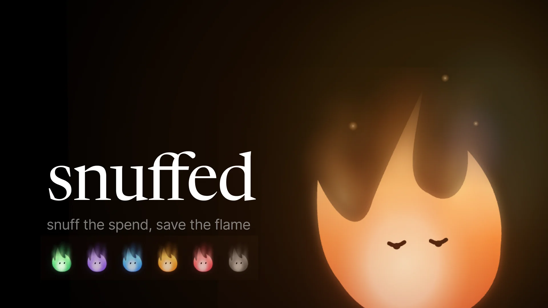
Snuffed
Designing the pause before an impulse buy
A cooling-off tool for impulse spending, built in a hackathon weekend.
- Design systems
- Interaction design
- Motion
- Hackathon
- Role
- UX Designer
- Timeline
- MHacks 2026 weekend
- Team
- 2 UX Designers
- 2 Engineers
- Tools
- Figma
- Cursor
- Expo
Overview
A pause the shopper writes for themselves
Checkout is built to be quick. Snuffed (SecondThought in the repo) gives the shopper a pause of their own design. They set their rules ahead of time. When a checkout matches a rule, a Chrome extension stops the purchase and asks one question: snuff this urge? The shopper can drop the purchase, save it for later or carry on. They can also ask a friend for support, but the decision is always theirs.
I was one of two designers on a team of four. I built the design system the product is drawn in, and designed the front end of the app, the pause and the landing page.
- 1stFintech track, MHacks 2026
- 6flame colourways, switched by one variable mode
- 15high-fidelity app screens in the system file
Status: a hackathon build. It has a Chrome extension running against a demo storefront, a React Native companion app, an iMessage check-in and a live landing page at snuffed.tech. It is not a shipped consumer product.
What I did
- Built the Snuff design system in Figma: tokens, gradients, type, motion and the components.
- Designed the high-fidelity app screens, and the device mockups we presented.
- Polished the front end of the app prototype, including the onboarding background and the saved-items archive.
- On the landing page, made the Chrome extension button, the hover pause cards and the smoke trail.
Done with others
- Karen, the other designer, shared the landing page with me. Its field of shop windows started on her branch, and she cut the demo video.
- Francisco and Vijay built the engineering: checkout recognition, the backend, and every integration (Neon, Gemini rule parsing, Photon iMessage, SpacetimeDB, Capital One Nessie).
Problem
Checkout friction runs in one direction
Online stores have spent years taking steps out of buying: saved cards, one-click checkout, countdown banners, "only 2 left". All of it makes buying faster, and nothing makes stopping easier. Willpower in the moment rarely beats an urge that the page was designed to create. The figures we pitched with put it at 92% of people buying on impulse, and about $1,800 a year on things they hadn't planned to buy.
Problem
People who want to spend more deliberately have no pause of their own at the moment they pay. The only friction at checkout belongs to the store.
Objective
A pause the shopper authors, triggered by their own rules, that gives them room to think and keeps the next step obvious. It should never shame them, and it should never decide for them.
Set a rule
In the app, in plain words: “pause non-essential purchases over $40.”
Shop as usual
The extension watches for checkout signals: a total, a payment form, a buy button.
The pause
A matching checkout is held, and the flame asks: snuff this urge?
The choice
Drop it, save it for later or continue. Asking a friend is optional.
The shopper decides every time. The pause only makes sure there is a moment to decide in.
Every choice feeds a flame that lives in the app, and a weekly leaderboard shared with friends.
Concept
Money that stops burning
The product's one gesture is putting a flame out. When the pause asks snuff this urge?, yes puts out the impulse. Giving in does the opposite: it dims the flame you look after in the app. One image carries the whole idea, so I built the visual language out of fire.
01
Fire is not orange
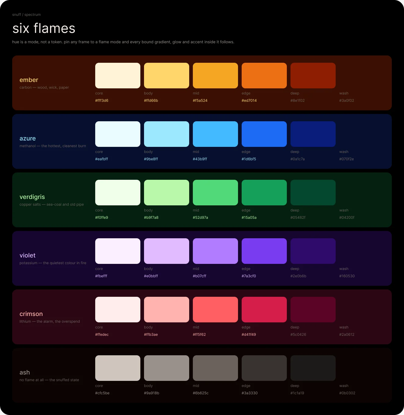
Different chemicals burn in different colours: copper burns green, methanol blue, lithium red, potassium violet. So the palette is six real combustion colours instead of one brand colour with tints. Each has the same six roles, from the white-hot core to the stain it leaves on the page.
02
No flat fills
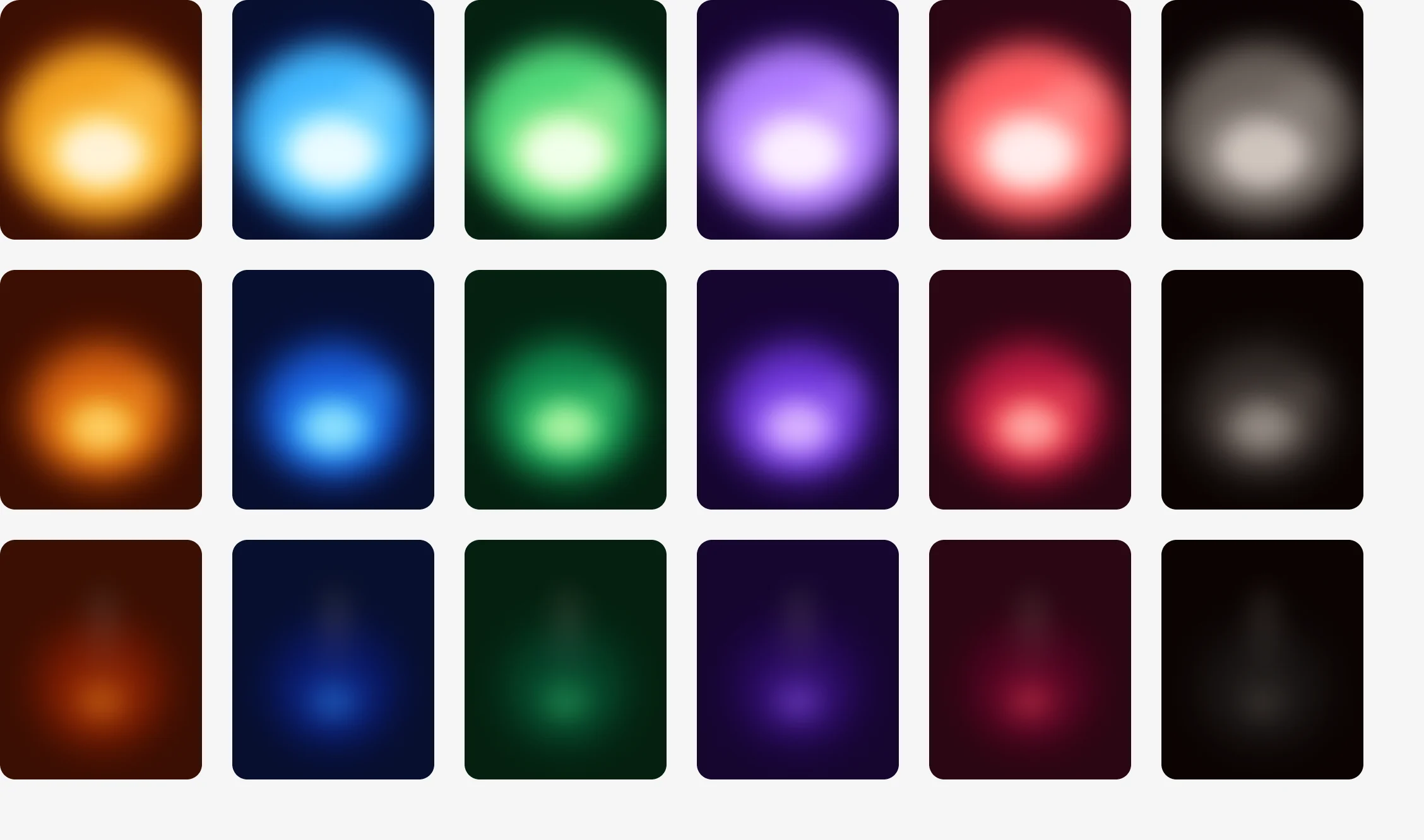
Anything larger than an icon is a gradient, or a stack of blurred shapes. Solid colour is kept for hairlines, type and icons. Every gradient stop is bound to a variable, so a surface painted once recolours in all six colourways without being touched again.
03
Nothing sits still
Every interactive component carries motion: a breath when at rest, a catch on hover, a snuff when dismissed. A static state is drawn as one frame of a loop, not the whole story. A component without its interaction wired isn't finished.
System
Six colourways, one switch
The colours sit in three tiers of variables, and the middle tier is the trick. Spectrum holds the 36 raw colours. Flame holds six role names (core, body, mid, edge, deep and wash), with one mode per colourway; each mode points those names at a different Spectrum row. Color is the semantic layer, and everything flame-shaped points into Flame.
Because every gradient, glow and border binds to the middle tier, setting the Flame mode on a frame recolours everything inside it at once. Swapping a colourway takes one change.
01
Lit and Snuffed are states, not themes
The Color tier has two modes. Lit is the default, and the room glows. Snuffed drops the same tokens onto charcoal and smoke. The structure is identical, but the fire is out. Setting Snuffed on a frame greys out a whole region, such as a disabled flow or a budget that's already spent.
02
True black, so the fire can glow
The page is #000000 and surfaces step up only one notch, to #050505. Raised surfaces stay charcoal instead of a warm brown, and a glow reads against them. Neco is the display face, Satoshi the interface face and Roboto Mono the label face. App copy is all lowercase.
- 180variables in 8 collections
- 75prototype reactions across 14 component sets
- 21paint styles, every one a gradient
Where it came from
The structure started from two references, read out of their stylesheets rather than sampled from screenshots: the dark architecture of Origin and the warmth of Ramp's design site. Neither palette survived. What did was the true-black page, a display face kept to display sizes and generous corner radii. An earlier version of the system was called Bloom, and the fire system replaced it.
Motion
Fire catches fast and dies slow
Every entrance is short and eager, and every exit takes about twice as long. That asymmetry is the system's personality. Five curves cover the whole product, and nothing uses linear easing.
Catch120ms
Hover, press, anything lighting up.Settle240ms
Toggles and selections, anything that lands.Snuff480ms
Putting out and dismissing.Smoke900ms
The wisp after a snuff. It starts 180ms late.Breathe2400ms
The idle loop of any lit flame.
Colour and shape never share a curve. The colour lags the shape by about a third, which is what makes a snuff look like cooling rather than a change of tint. The signature gesture is storyboarded frame by frame in the file:
0ms
Lit and breathing.
120ms
Press: the core compresses and drops, and the halo swells.
300ms
Collapse: shape first, colour behind it.
480ms
Out, with one cooling ember left.
480–1380ms
Smoke: an ash wisp rises and thins.
What Figma couldn't carry
Catch, Settle and Snuff are wired into the prototype. Breathe and Smoke aren't: swapping a variant can't express a loop or a delayed start. So those two are written as instructions for the build. That was a real limit, and the file says so instead of faking it.
The pause
One question, and the shopper decides
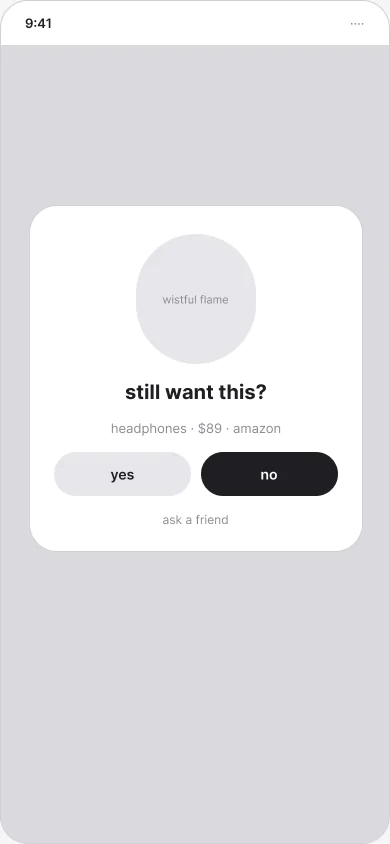
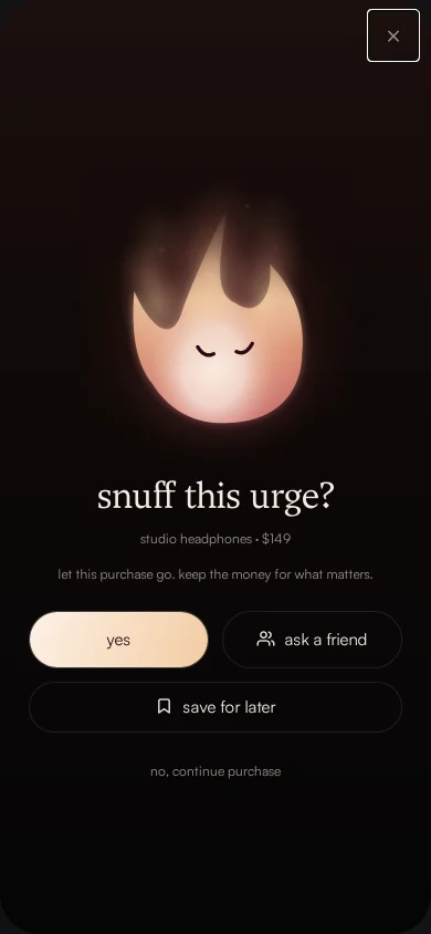
At its simplest, the pause is a sentence and a few choices. The structural pass shows it plainly: the shopper's own rule is quoted back to them, followed by the three outcomes.
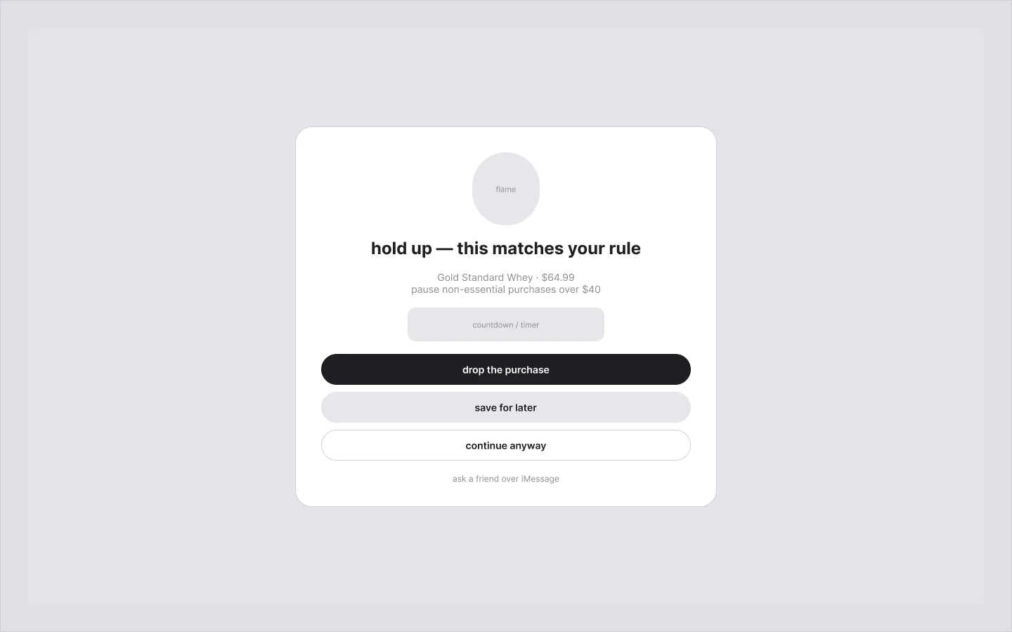
The finished card tells the same story more gently. Hold up became snuff this urge?. A friend moved up from a footnote link to a button beside yes. Continuing became a quiet text link: always available, never the loudest thing on the card.
The team's own write-up named what we were balancing:
We spent time balancing clear choices with gentle wording, restrained notifications, and expressive animation. The interface needed to give users space to think while keeping the next action obvious.
01
A friend is support, not a gatekeeper
Asking a friend sends a short iMessage check-in. It asks for encouragement, not permission, and it says so: “reply with anything encouraging. you’re not deciding for them.” By default the friend sees no item, price or merchant.
Product
One flame on every surface
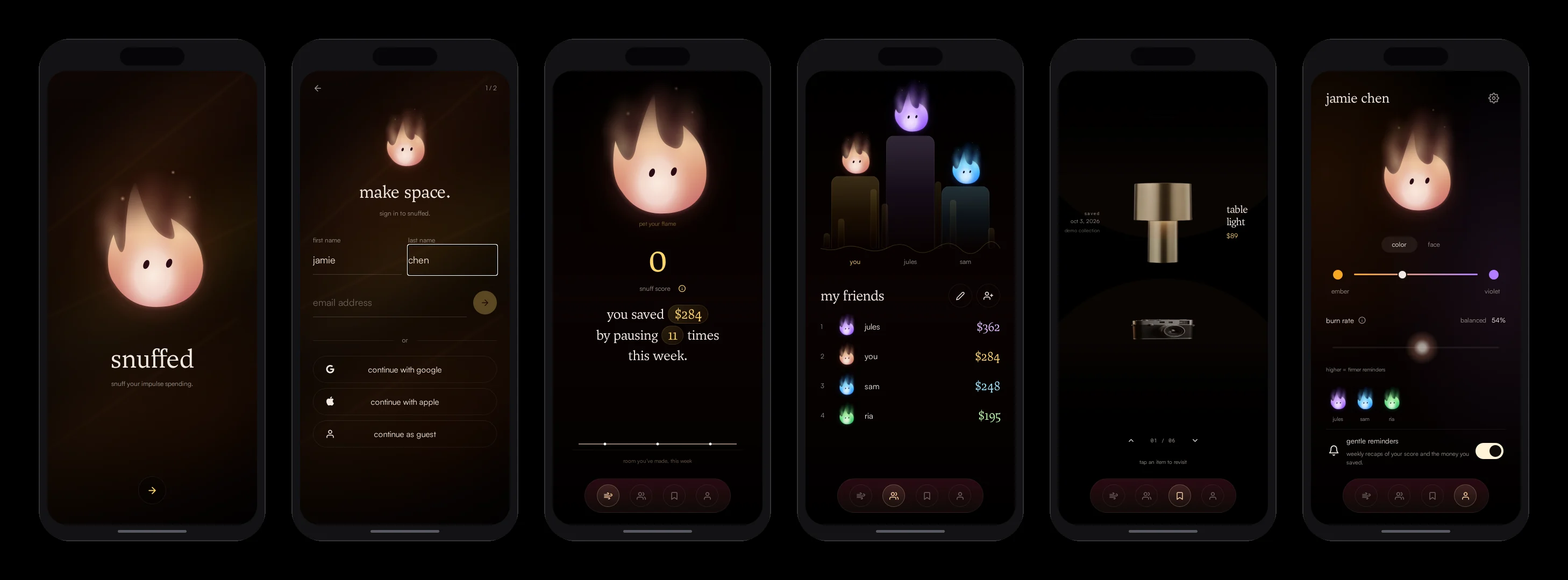
The same flame appears in the app, at checkout and on the landing page. The app is where it lives between purchases.
01
The archive is a lens, not a list
Saved items scroll through a refracting lens, after Colton Tollett’s lens-scroll study. The item in focus is magnified, and the ones above and below bend away at the edges, so the things you didn't buy are something to browse rather than a list to scroll.
02
The landing page demonstrates the pause
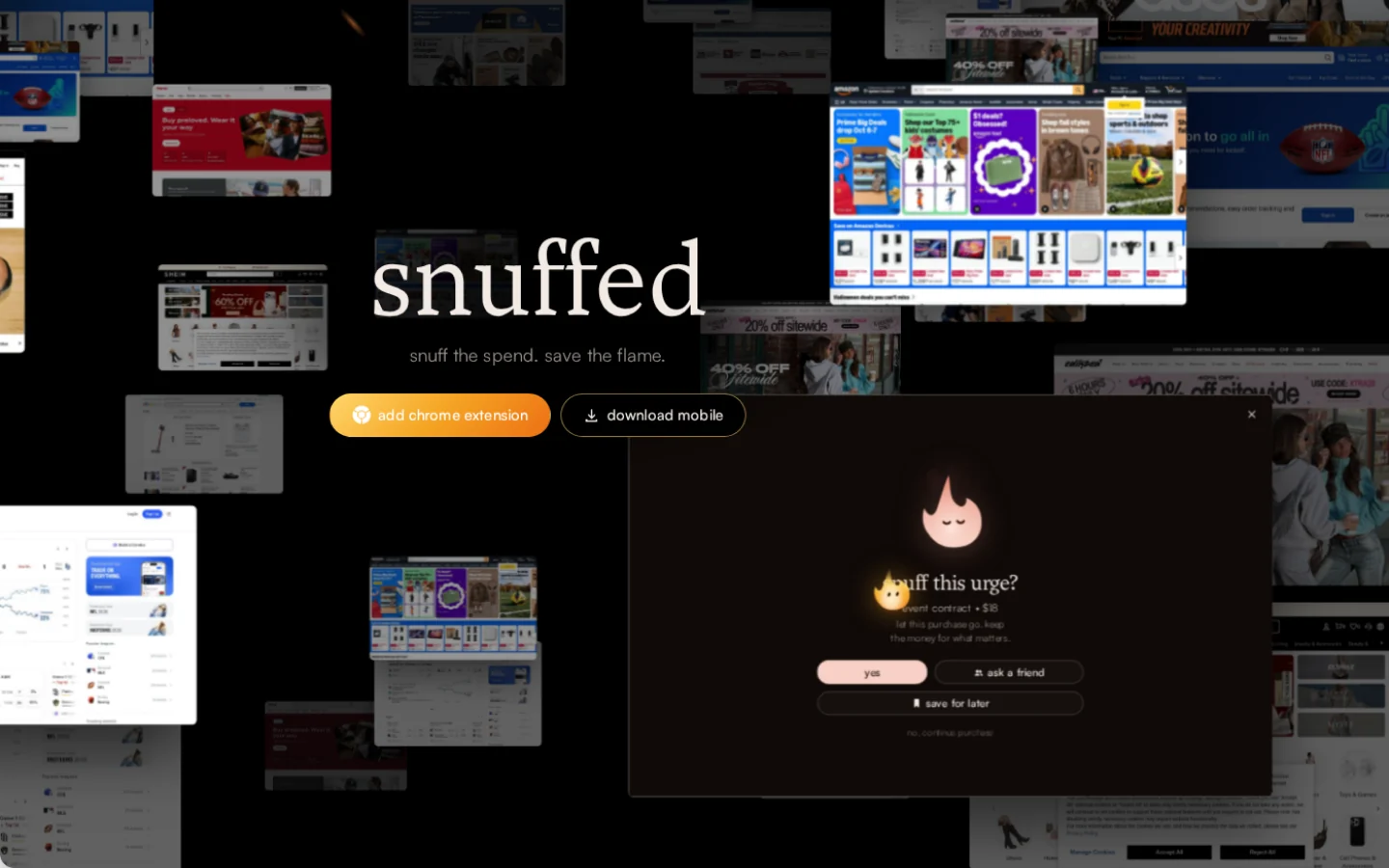
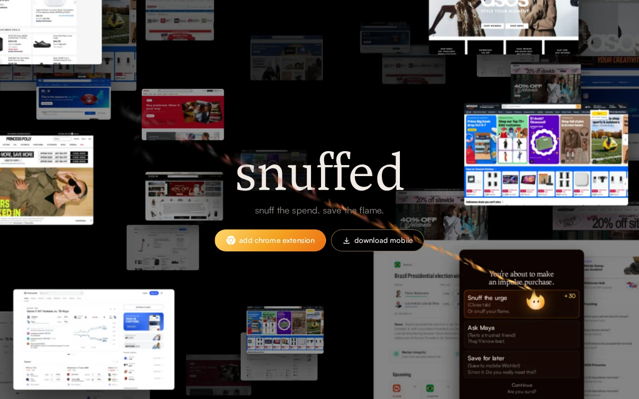
Snuffed.tech floats real storefronts around the wordmark. Hovering a shop window opens the same snuff this urge? card, each one in its own flame colour. A visitor meets the pause before they've installed anything.
03
One button for the thing that matters
The page first offered Mac and Windows downloads. But the extension is how Snuffed reaches a desktop checkout, so I replaced both with a single add chrome extension button, with download mobile beside it. I deepened the button's ember gradient so a white Chrome mark could sit on it legibly.
04
Smoke follows the cursor
The cursor is a small flame. Its smoke streams away from the direction of movement and lofts softly, instead of rising straight up from the tip, so it trails like smoke behind a moving candle.
Outcome
First place in the Fintech track
By the deadline, the pieces connected end to end: checkout recognition, a visible pause, the app updating, saved history and a friend's reply coming back into the pause.
ExtensionDemo store
Recognises checkout on a demo storefront and holds it behind the pause.Companion appPrototype
The flame, savings, friends, the archive and the profile, in React Native.Landing pageLive
Live at snuffed.tech, with the pause demonstrated on hover.Design systemFigma
Tokens, 14 interactive component sets, 15 screens and the motion spec.
How far it goes
The dependable demo is one storefront: a $64.99 tub of whey protein and the extension. Recognising checkout across arbitrary stores is the next problem, not a solved one.
Reflection
What I took away
01
A system first is a bet a weekend can lose
I built the system before the screens, and the screens came out consistent because of it. But the team's write-up is honest about the cost: building the system apart from the engineering produced more than an MVP needed, and left less time to test. The wireframes came after the first high-fidelity pass, to check structure, rather than before it. In a hackathon window I'd sketch the structure first and grow the system out of the screens that ship.
02
Accessibility came second, and it shows
The dark surfaces and muted text pass comfortably. The fixed colourways (crimson as an alarm, violet as an accent) on their own deep backgrounds are decorative contrast, not AA body text. Some atoms (buttons, fields, chips) still come from an earlier paper-light version. The app freezes the onboarding background under reduced motion. The full contrast pass is still owed.
03
Next
I'd add dark variants for the remaining light atoms, connect the components to code so the app consumes the tokens directly, and put the pause in front of real shoppers to learn which wording and which reminders actually help.