MHacks 2026 · 1st place, Fintech
Snuffed
An app and Chrome extension that catches an impulse buy at checkout, and makes not buying it feel like a win.

The problem
of people buy on impulse, about $1,800 a year on things they never planned to buy. The figures we pitched with.
Checkout only speeds up.
Saved cards, one-click, “only 2 left”. Stores keep taking steps out of buying. Nothing makes stopping easier — so we gave the shopper a pause of their own.
How it works
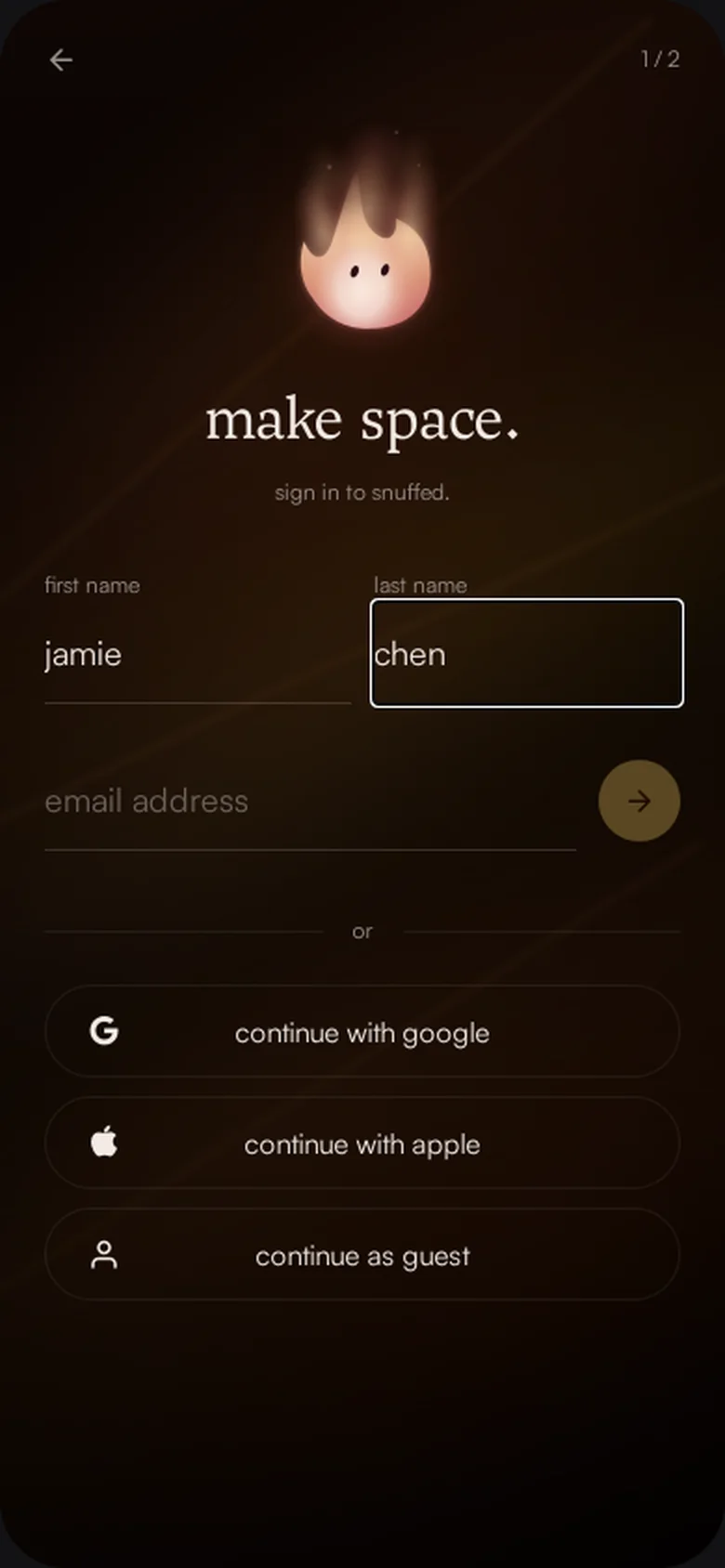
Set a rule. Shop. Get paused.
- 1
Meet your flame
Sign up, write your rules in plain words (pause non-essential buys over $40) and meet the flame you look after.
- 2
Get paused
When a checkout matches a rule, the Chrome extension holds it and asks one question.
- 3
Choose
Snuff it, save it for later, or ask a friend for support. Continuing stays one quiet link away.
- 4
Keep it lit
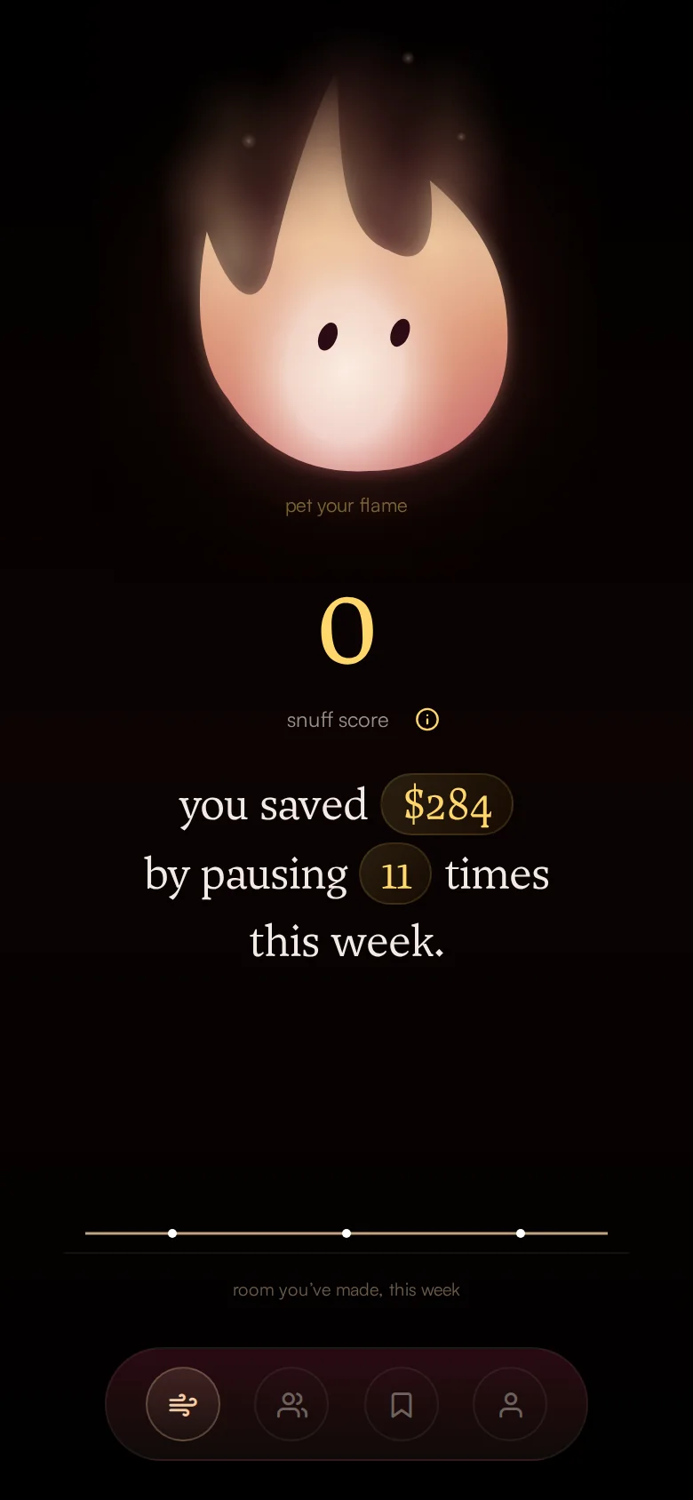
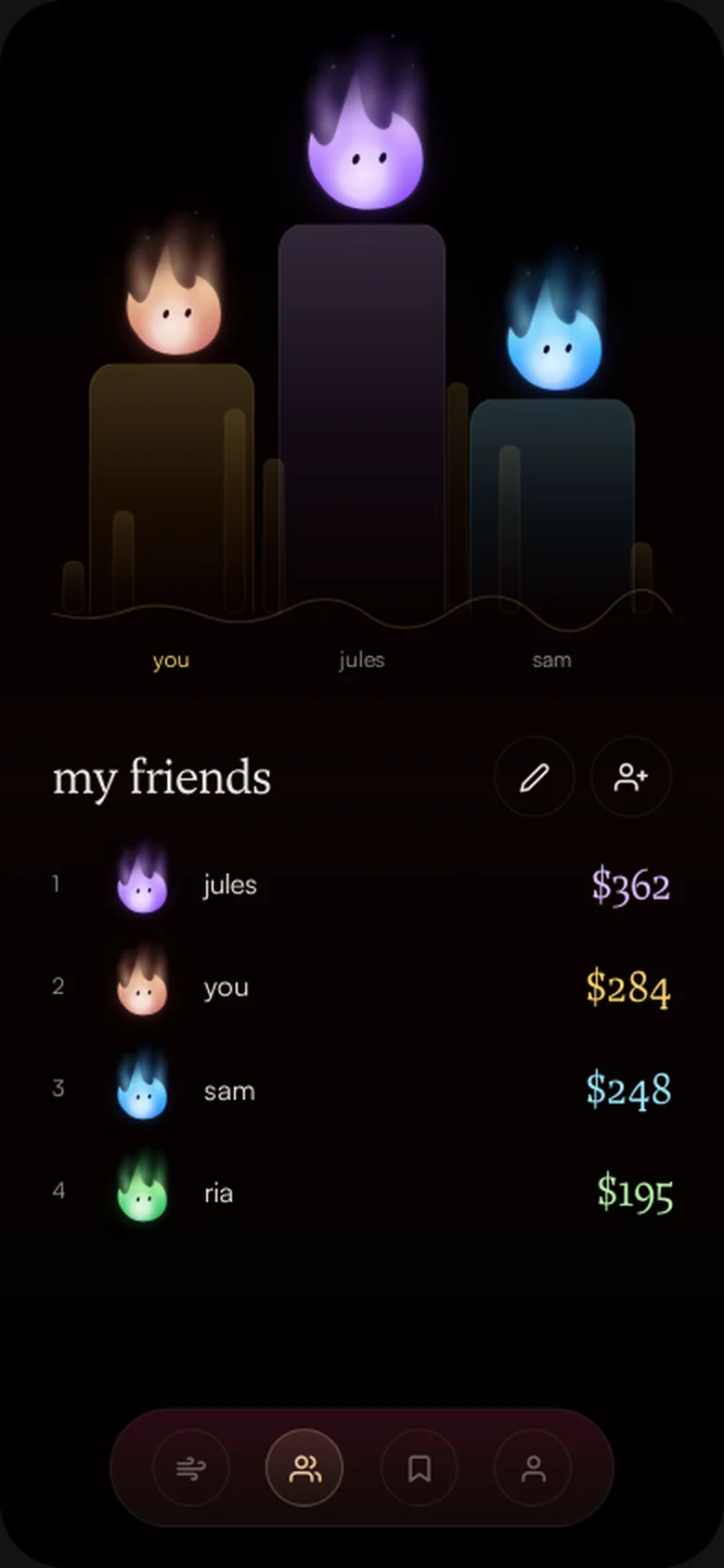
Every snuff feeds your flame and your Snuff Score, ranked with friends on a weekly leaderboard.
The pause
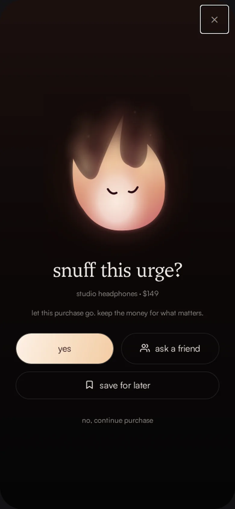
snuff this urge?
Four answers. None of them shame you.
- Yes
Snuff it
The urge goes out, the money stays, the flame grows.
- Later
Save for later
Into the archive, to revisit with a clear head.
- Support
Ask a friend
An iMessage check-in for encouragement, not permission. No item or price by default.
- No
Continue
Always there. Never the loudest thing on the card.
A friend can cheer you on. The decision is always yours.
- 1
Home
Your flame, your Snuff Score and what pausing saved you this week.
- 2
Friends
Flames on a podium and a weekly leaderboard. Resisting, made social.
- 3
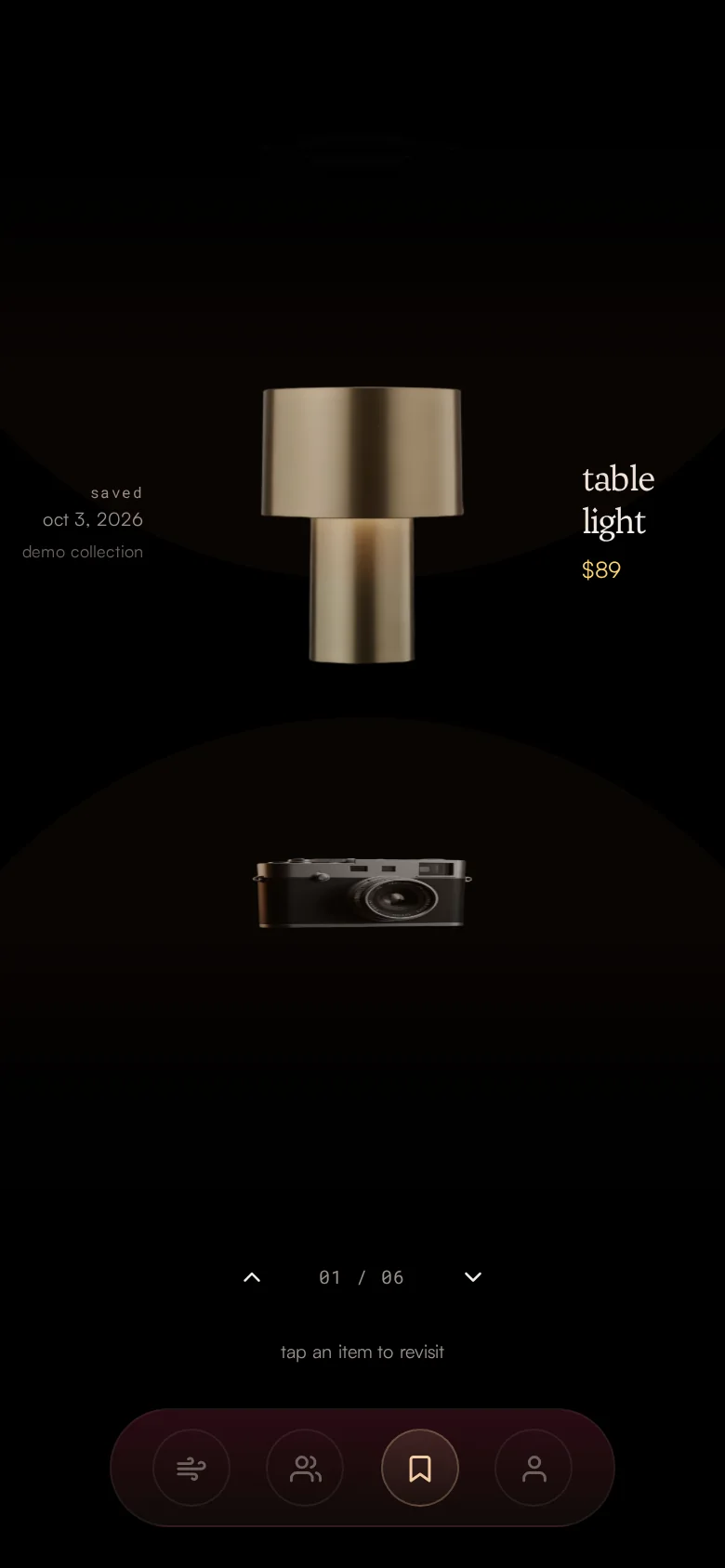
Archive
What you didn’t buy, browsed through a refracting lens. The objects are placeholders generated with xAI Grok Imagine.
- 4
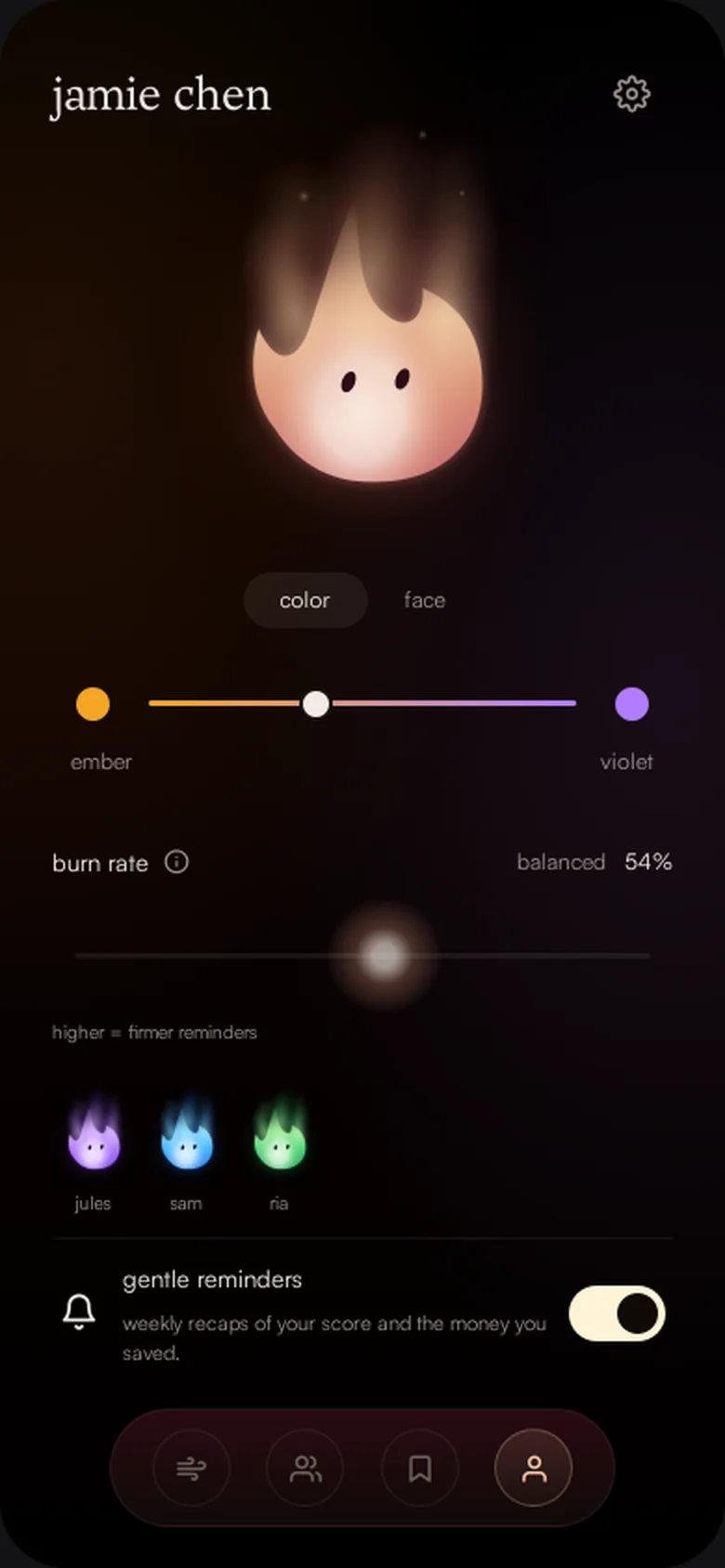
Profile
Blend your flame’s colours, check your burn rate, set gentle reminders.
- 5
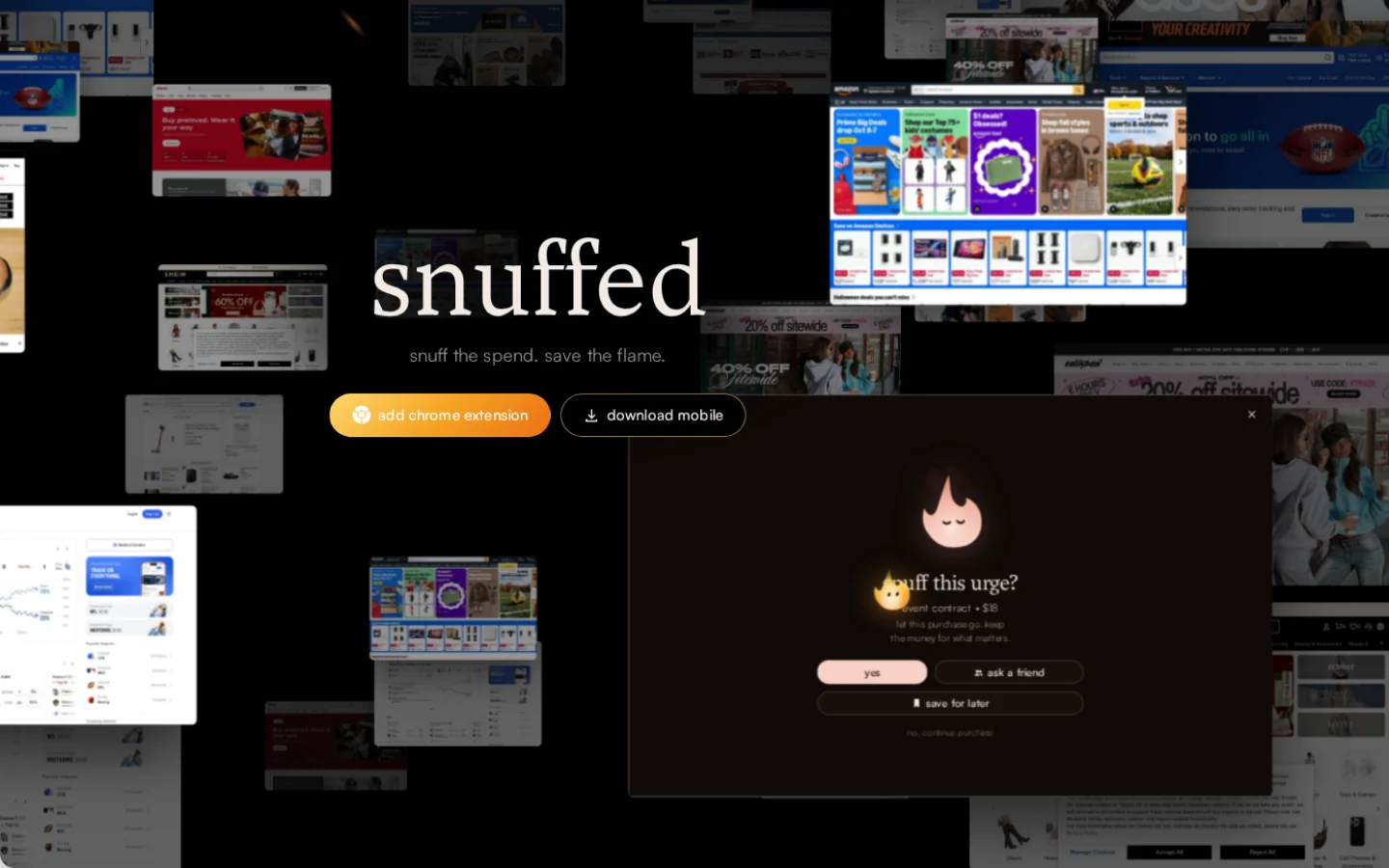
Landing page
Live at snuffed.tech. Hover a storefront and the pause opens over it.
The Snuff system
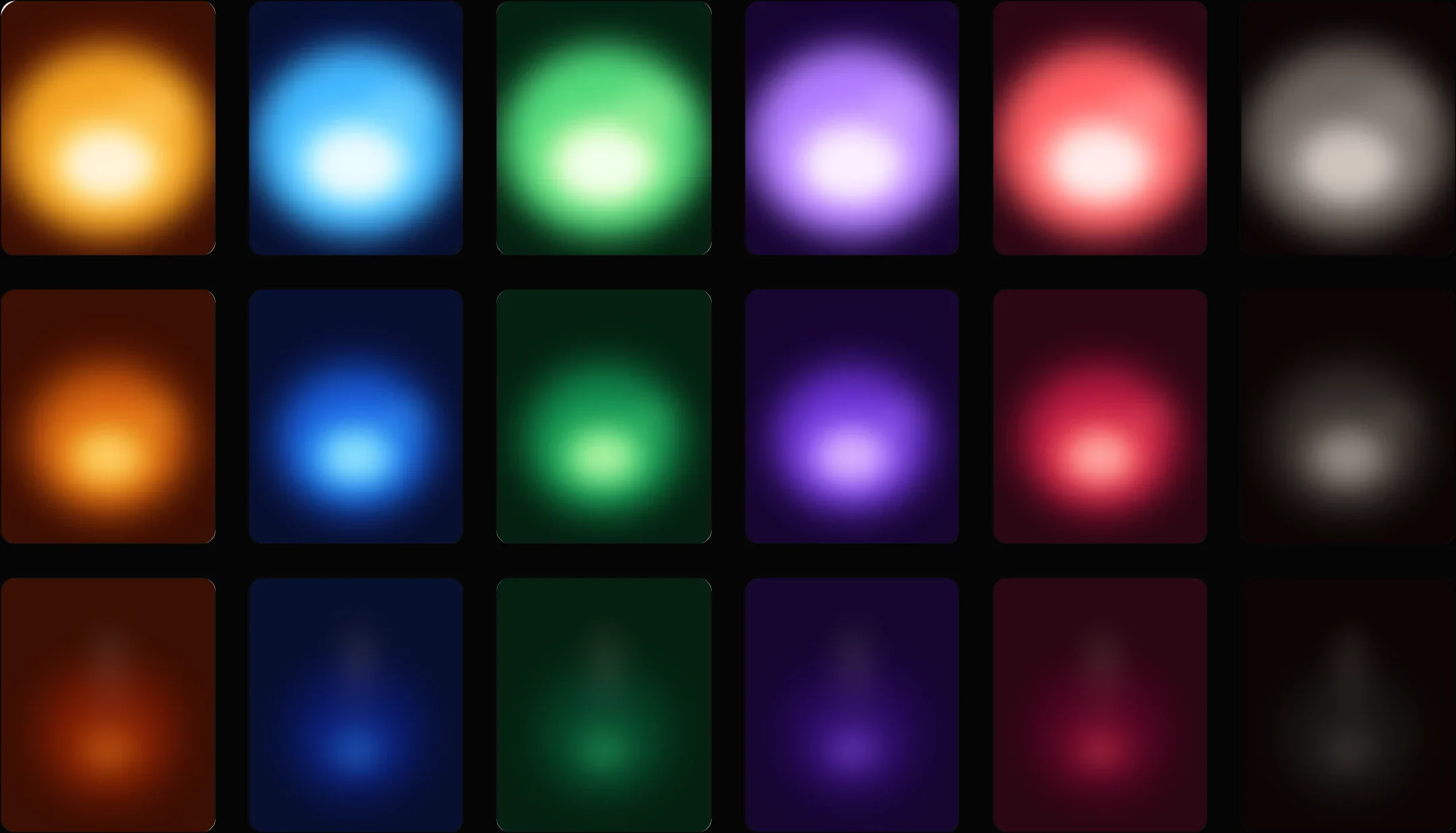
Six colourways, one variable switch.
Who built what.
- Designed
Snuff design system
Tokens, 14 component sets and motion, in Figma.
- Designed
App + landing front end
Screens, the pause, hover cards, smoke trail.
- Engineered
Chrome extension
Deterministic checkout matching on a demo store.
- Engineered
Companion app
React Native and Expo, live over SpacetimeDB.
- Engineered
Backend
Node on Neon; Gemini parses written rules.
- Engineered
Integrations
Photon iMessage and Capital One Nessie.
I designed the dark tiles. Francisco and Vijay engineered the rest; Karen, the other designer, shared the landing page and cut the demo.
What I took away
- 1
Timing, clarity, trust.
The pause only helps at the moment of the urge, has to say plainly why it fired, and can never take the decision away. Every choice on the card answers to those three.
- 2
A system first is a bet a weekend can lose.
It is why fifteen screens, a pause and a landing page read as one product. It also cost us testing time. Next time I’d sketch the structure first and grow the system from the screens that ship.
- 3
Next: real shoppers.
Test which wording and reminders actually help, finish dark variants for the last light atoms, and wire the components to code.